User Interface V5 - Playing Sentences

This is a description and review of the new V5 interface when playing sentences. I have tested this by playing sentences using the vocabulary option with text input method, and for a few sentences I have then also chosen the multiple-choice option to note any changes therein. I have not tested the listening or speaking options.

The first change with the new interface when clicking “Play” (or “Review”) is to the Play Options dialogue -


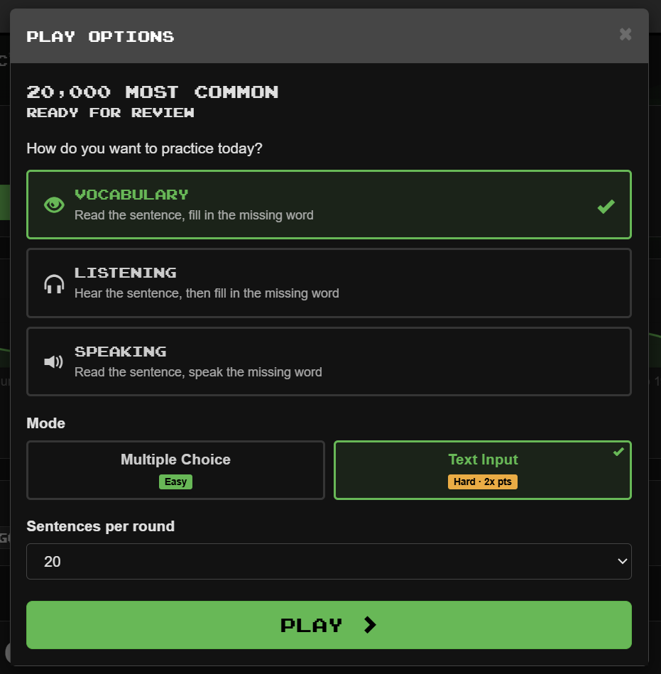
I personally think that is an improvement, even though it is mostly aesthetic changes.

I note that Text Input is no longer classed as “Difficult” but is now merely “Hard” :joy:. I’m still not convinced that calling Multiple Choice “Easy” is a good idea, as someone who doesn’t find that to be easy could be discouraged by that choice of word (“I can’t even do the easy thing, I’d better give up now :sob:”).

When you then hit “Play” you are taken to the new playing interface -

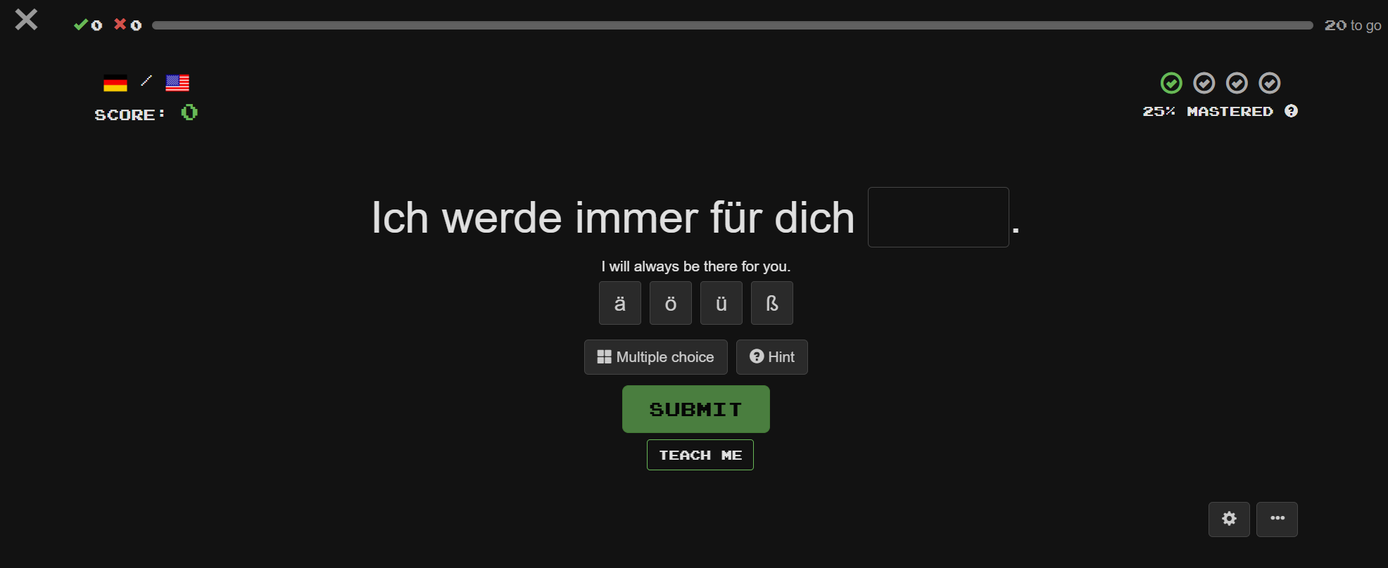
The top of the page is greatly simplified, with all of the entries (buttons, Clozemaster banner etc.) having been removed and replaced with a simple X in the top left corner.

The Multiple Choice and Hint buttons now have words to describe what they mean, and the Help/Flag Sentence/Round History have been pushed into the button with the three dots (and Flag Sentence is no longer bright red) -

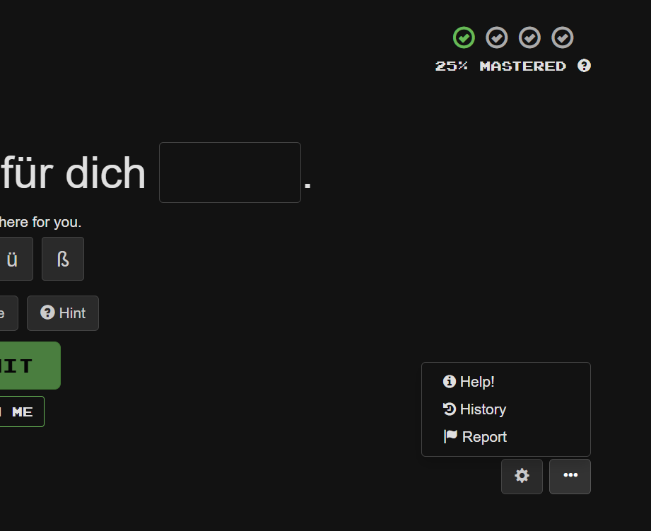
At this point I could go into a long discussion about flagged sentences and correcting errors, and whether reported errors get fixed (which may depend on the language etc.). Therefore I’m not sure that “hiding” the reporting flag is helpful - and also I would often tell people to use the “red flag” to report errors, which I couldn’t say anymore as the flag won’t be red. On the other hand, I think that there might be an opportunity to come up with a better system for discussing and then reporting errors by simply using these discussion forums.

There is also now a “Teach Me” button, which I’ll briefly mention in a separate post.

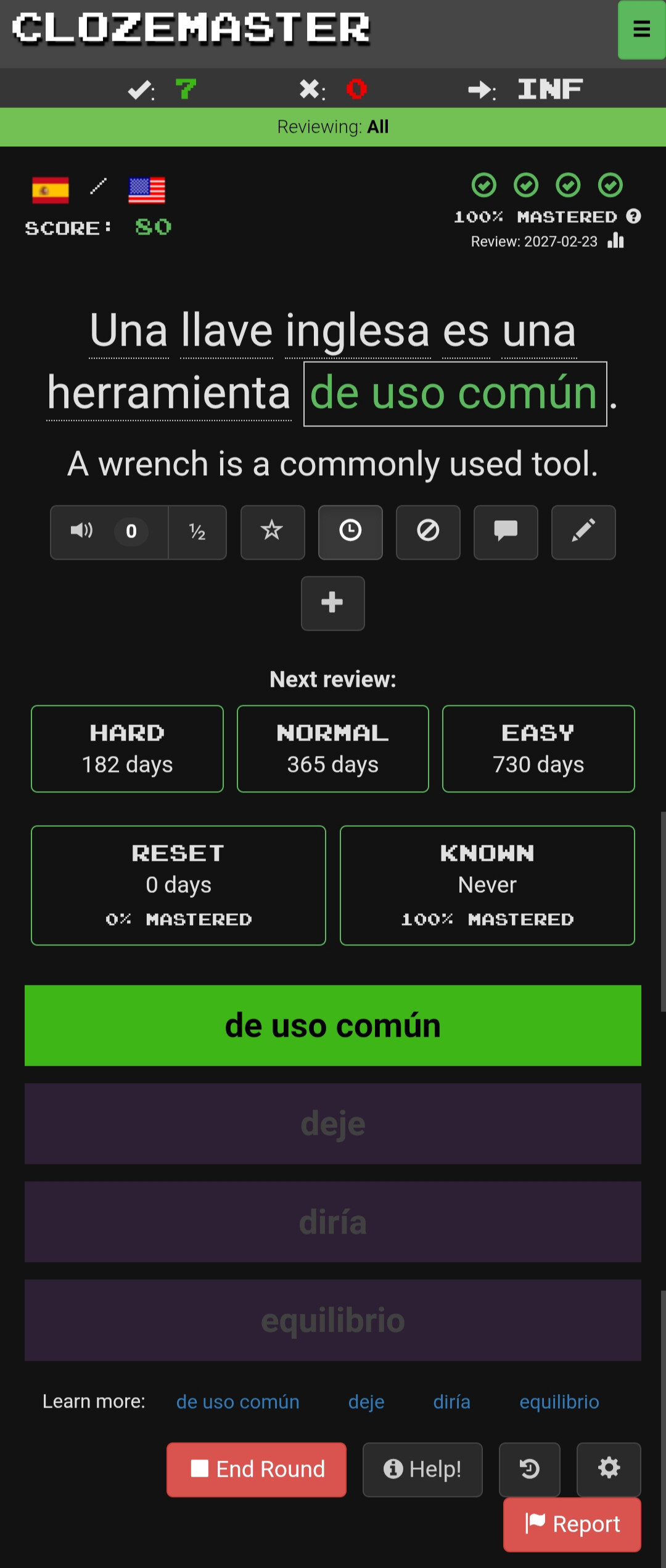
When a cloze has been correctly answered, the interface changes as shown here -

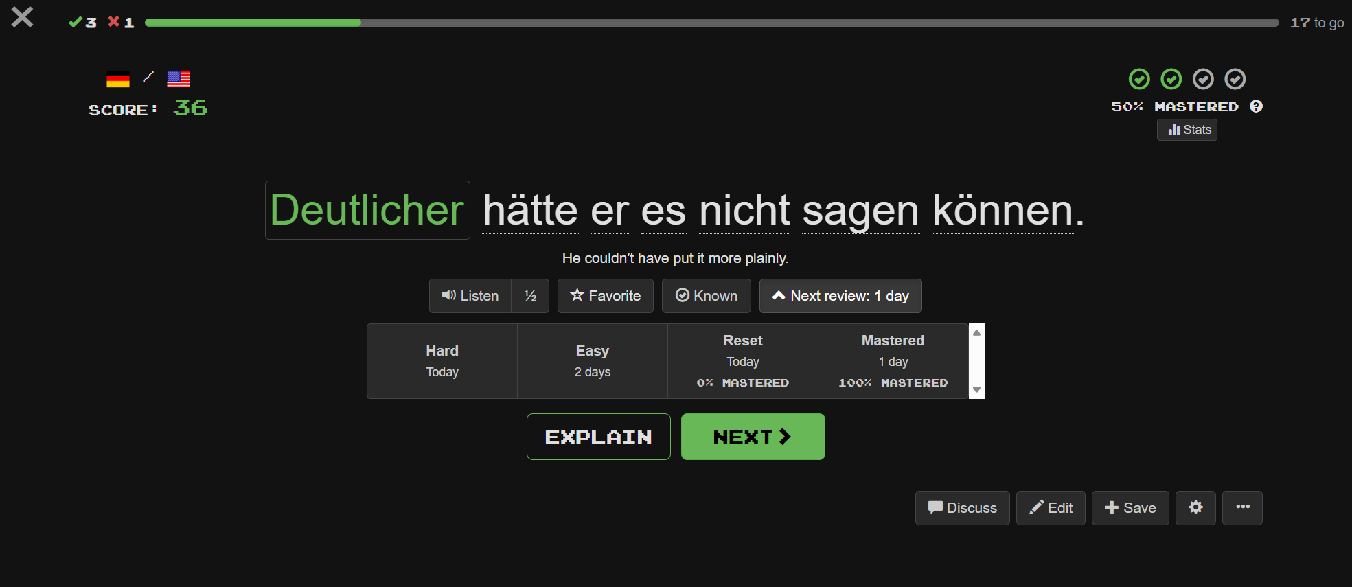
The most obvious change from the current interface is the list of options for adjusting the next review time. In addition, the other buttons on the current interface all appear, although some of them such as Discuss and Edit have moved to the bottom right of the page.

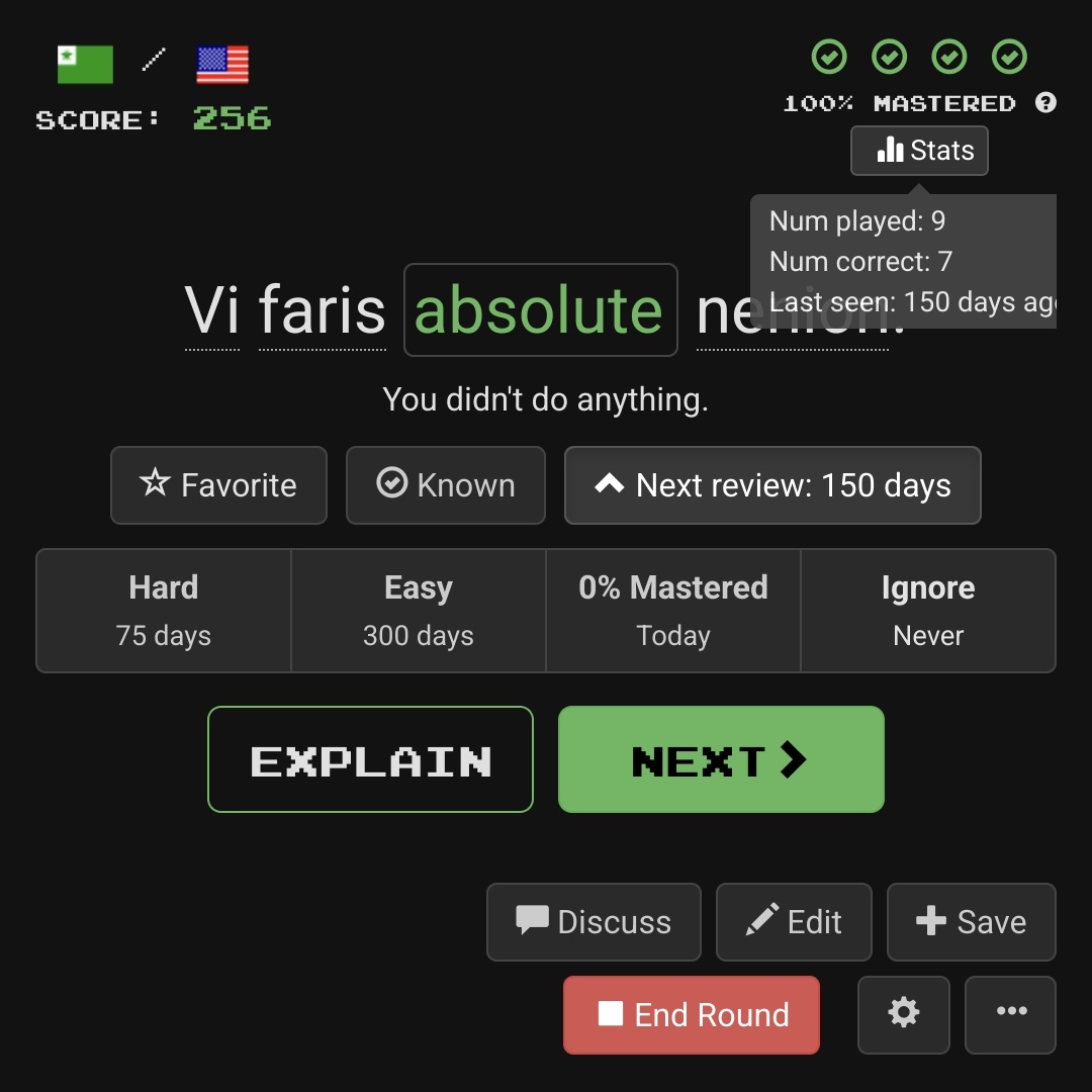
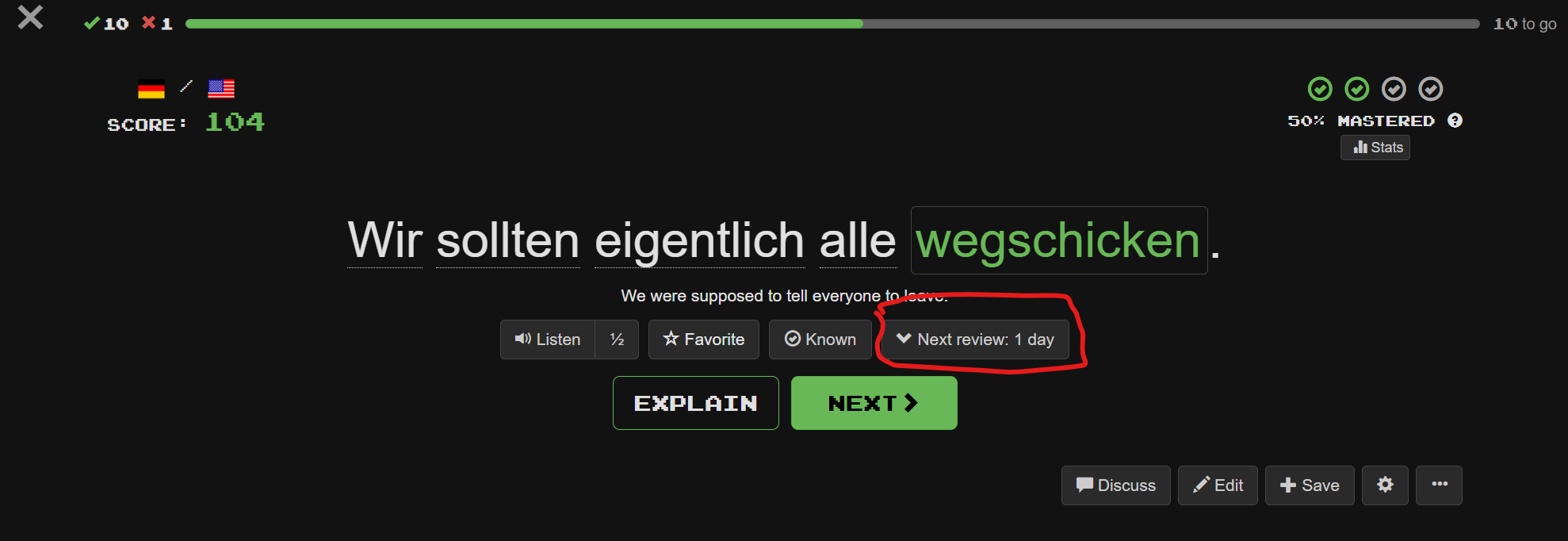
If you don’t want the list of options Easy/Hard/Reset/Mastered then you can press the arrow next to “Next Review” and this options panel will disappear until some future time when you might choose to press the arrow again -

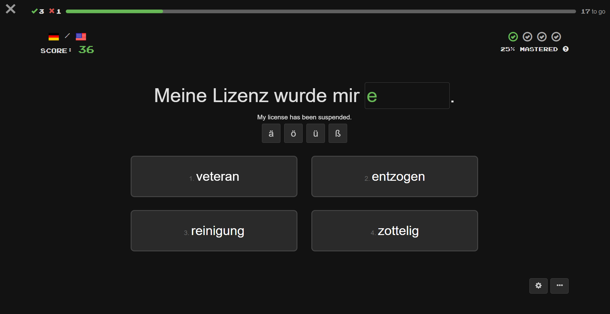
The only notable change to the multiple choice options is that the option boxes no longer have a purple background -

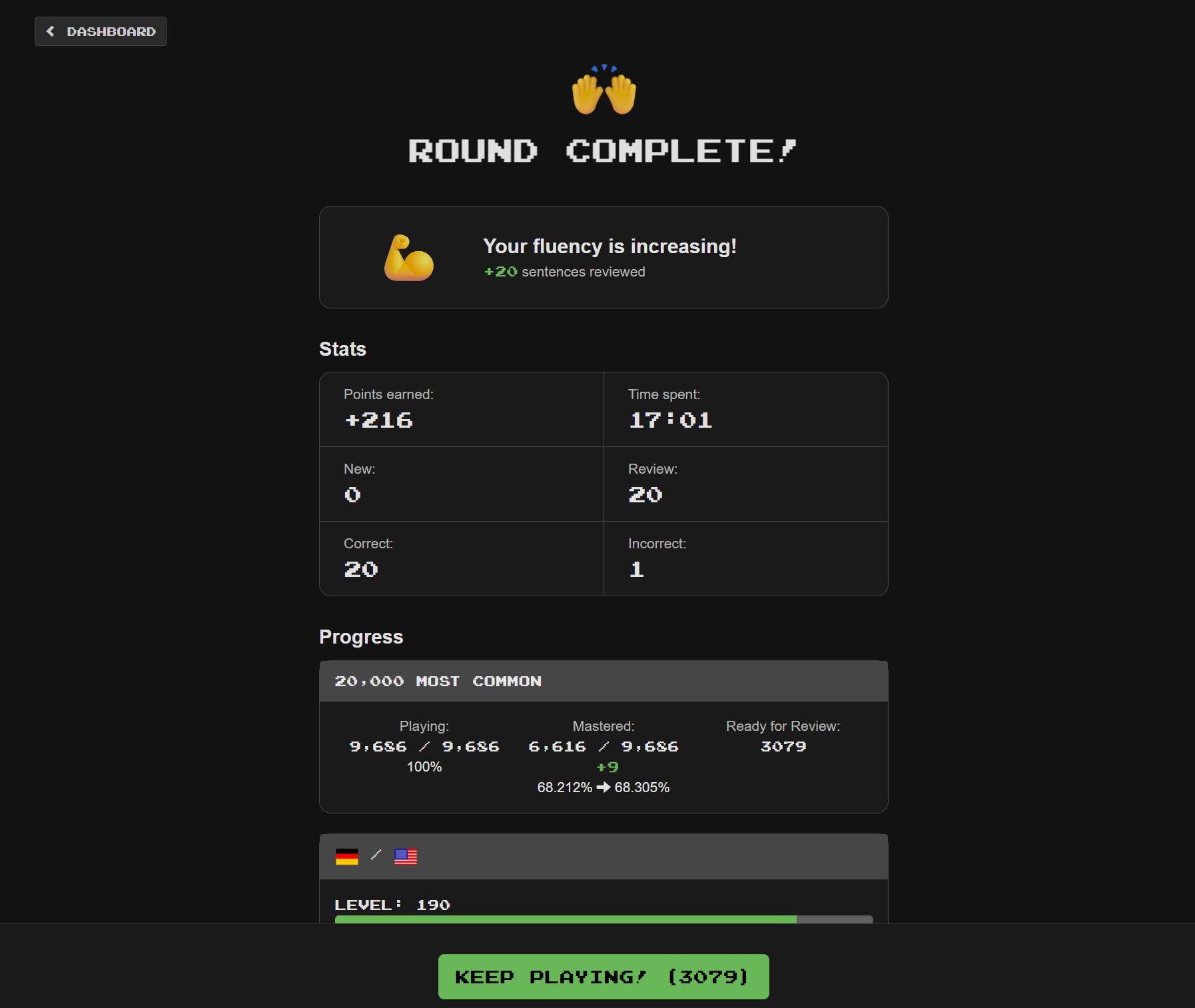
Finally, on round completion, the interface again looks a little different, but there don’t appear to be any changes to functionality -

Mark as Known change
I did encounter one significant change while playing related to marking items as known. I use the Alt+K keyboard shortcut to mark items as known.

When marking an item as known (using Alt+K), the interface now immediately moves to the next sentence.

Usually when I mark an item as known, I immediately want to move on to the next sentence, but that isn’t always the case. Sometimes I might mark an item as known, and then look at the sentence, perhaps examine other parts of the sentence, use the wiktionary interface, or else choose to mark the sentence (and possibly other sentences with the same cloze word) as “Ignore”. I can no longer do any of these things with the new interface, as the sentence disappears before I can do anything. I would have to change to only marking a sentence as known as the last thing that I do which would take some getting used to.

I also noticed that if I hit Alt+K and then immediately hit the enter key (which is my current behaviour for most “mark as known” sentences), the new interface will frequently skip over the next sentence in the list, so that instead of playing 20 sentences in a batch, I might find that I only played 16. The other sentences would still be due to play/review as they didn’t get played, but this is still an annoyance, and it is also clearly a bug.

In short, I fully understand why it makes sense to immediately move on once a sentence has been set to “mark as known”, but I would prefer to stick with the current behaviour.

4 Likes

My general observation is that most things I usually do after answering have been made more cumbersome, requiring more scrolling or having to use the new menu.

  • The Edit button is now at the bottom of the page.
  • Likewise for the Discuss button (so I will miss seeing that some cloze has an ongoing forum discussion).
  • Sentence Source and Report are hidden behind a tiny menu button.
  • The same goes for History.
  • I can no longer open the Forum directly, as the old menu has been removed.

The only really good new feature, in my personal opinion, is the ability to modify the next review date with somewhat more precision than before, which I’ve already been doing for quite some time now, using the undocumented “&nextReviewControlsEnabled=true” option. However, I still think that a better solution would be to provide a pair of buttons to increase and decrease the number of days, respectively, using different multipliers for each button, allowing the user to find the exact number of days to their liking.

5 Likes

By the way, the top-left X button, to end the current session, doesn’t work: it asks for confirmation but doesn’t exit.

2 Likes

@mike Cumbersome - the things I could see at a glance are now tiny or hidden. I don’t need a big graph taking up so much space! It also still irritates me that “Italian from English” shows as my second language of learning instead of my main chosen language, the “English from Italian” being a much later add-on. So wrong Streak info still annoys, Italian from English should be 2046 and not 403!

On mobile, can only use Easy mode as popup keyboard covers all detail.

Had just come to terms with the last update but not sure if I’ll stay after this one. I loved ClozeM from the start, perfect as it was, so this may be “Addio ClozeM” unless I just forget the app completely and go web. Scuse the moan.

Ps. On the app Dashboard is there any way I can see my daily target without having to stop n click on top lefthand corner flag? I’ve looked all over highly detailed db but can’t see it. Thanks for any help.

3 Likes

For comparison, let me show you what playing looks like using the “nextReviewControlsEnabled=true” option, which I find more satisfactory. On my phone I have to scroll to find the lower set of buttons, but there’s nothing hidden in menus, and the “discuss” icon is eminently visible.

The only thing I prefer in the new interface is the good riddance of the huge list of sentence-list links at the bottom (not shown here).

3 Likes

In the new interface, was the “Ignore” button… ignored?

In the current interface, the “Ignore” button (a circled slash) brings up a dialog that lets you either ignore the current sentence (“Ignore”) or all sentences with the same cloze (“Ignore All”). In the new interface, the Alt-I keyboard shortcut still brings up the old “Ignore” dialog (though I didn’t realize that for a long time). If you don’t use the shortcut, then to ignore a single sentence, you need to choose “Edit” and then click the “Ignored” checkbox. I’m not sure whether there is any way to perform the “Ignore All” action at all without the keyboard shortcut.

“Ignore All” was very important to me in the initial stages of playing because it allowed me to exclude the many sentences where the cloze was an over-used and under-useful word like “Tom” or “Boston”. Only after this was Clozemaster worth playing. I remember that in my earliest days on the site, an “Ignore All” action used to take a very long time (probably several minutes), perhaps because it didn’t take advantage of indexing to efficiently find matches. (It became much faster later.) Even with the long wait, however, it was worthwhile for me to exclude sentences with clozes I didn’t want to learn.

I personally don’t need to use “Ignore All” much these days because my collections and review queue have evolved over time, but it’s quite possible that new users do need it.

I do still use the “Ignore” button perhaps twice a day on average, even with review sentences (usually because I’ve decided that the cloze is a “leech” without much practical use for me), but especially with new sentences. I personally can retrain myself to use Alt-I, and other users may put up with the additional scrolling (after pressing the “Edit” button) and the need to navigate to the little checkbox, but I don’t see why this button was demoted so heavily. A consequence of the demotion is that new users are not going to discover it.

2 Likes

I hadn’t noticed that change.

I frequently use the keyboard shortcut Alt-I, and I then frequently choose “Ignore All”.

Having the Ignore button removed for people who don’t use the keyboard shortcut is - in my opinion - a serious regression.

4 Likes

On a phone, keyboard shortcuts are either impractical or impossible to use.

@mike , are you following this discussion?

2 Likes

I am! Thanks for all the feedback! Super helpful.

What browser are you using when this happens?

What do you mean here, do you mean your daily goal or something else? Daily goal is front and center in the new dashboard.

Yes :sweat_smile: that and other fixes should be up tomorrow/Friday, will post back then!

1 Like

Speaking for myself (not morbrorper), in Chrome on Windows, nothing happens (not even a dialog) when I click the X. In Firefox on Windows, I do see a dialog, which does let me exit from the round.

1 Like

My browser is Vivaldi on Android.

1 Like

Hi @mike Thanks for your patience and responding to us all. With some exploration and a little less angst, I’ve found my rhythm again. ClozeM you’re still the best!

2 Likes