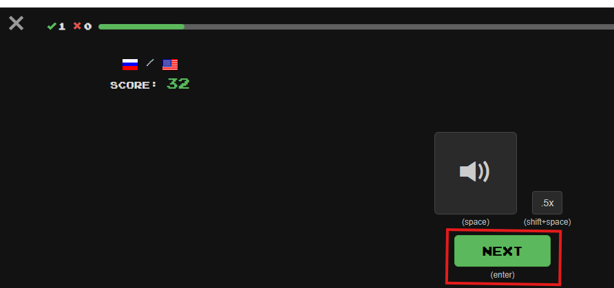
Super-confusing: In Listening mode, “Next” doesn’t always mean “Next sentence”. Sometimes it means “Press this button in order to see the ‘eye’ button that you can then press to see the translation.” Why???
There is only one change I care about: The “Use an always increasing next review interval with Hard/Normal/Easy buttons after answering to modify the rate of increase” review option no longer works. For me, this was the best new feature Clozemaster ever implemented, and I consider it critical to my learning. I uninstalled the Android app because (last checked) it didn’t have this review option, so I use the browser version even on my phone. Without increasing intervals, reviews snowball unmanageably. Please, please, please make this feature work again!
Currently, I don’t want to do reviews because I don’t want sentences that would normally pop up over a year from now to be reset to a shorter review interval.
6 Likes
App still doesn’t have it. I’ve just changed my review order to start at 0% until it works again…
@mike Is the bug with spaced repetition in the queue of issues to work out? Appreciate the fixes so far.
2 Likes
Thanks for letting us know! This should now be fixed for 100% Mastered sentences. The same Hard/Easy controls are used, just the intervals are according to the review settings. If the number of days you’re seeing don’t seem right or there are any other issues please let us know of course. Same @blueandnerdy
3 Likes
Works for me now. Thank you!!!
1 Like
I’m not sure if the review fuzz is working–I got a bunch of sentences that all came up with the same numbers of days in the future. (It’s possible the 5% didn’t need to be applied of them, but there were probably 30+ sentences that were showing up for the first time after my normal 100% interval, so I would have expected at least some variance in those.)
Edit: Also, the number on the “standard” button that shows the other options seems to always stay on my normal 100% setting. Have not checked yet which interval ends up being applied.
1 Like
The fuzz is applied server side / after you select an option. You should be able to confirm by answering a sentence, then searching for it via Manage Collection for the collection on the dashboard and checking out its next review interval.
Will check on the default option.
1 Like
In order to reach the language selection and “general purpose” dropdowns:
![]()
you now need to go to the dashboard. Is there a reason for this? In terms of space, there’s plenty of room for them in other windows, such as the “Round Complete!” window (note all the empty space at the top of the screen):
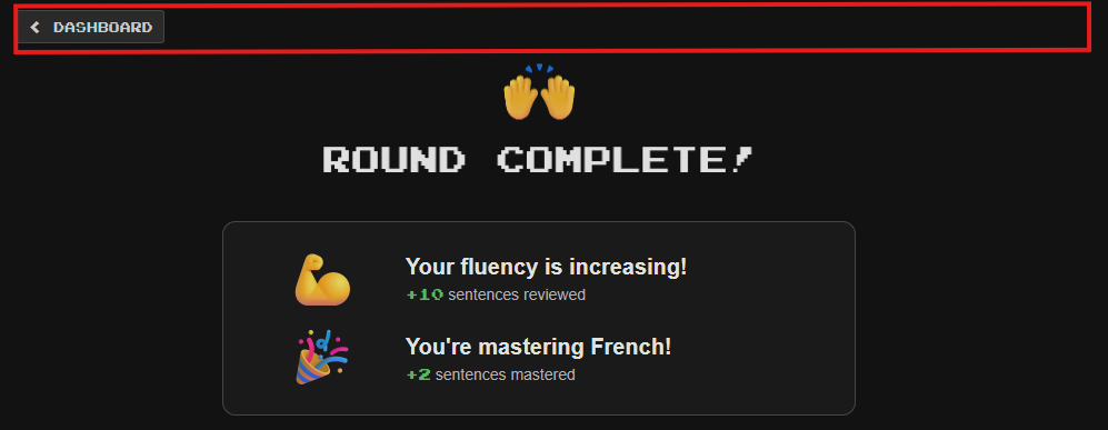
My own pattern is to start with one review round in each of my languages. After a review round, having to press the “Dashboard” button before I can access the language selection button to go to the next language is a pain – a small one, but a pain nonetheless. Even if there’s some reason you don’t want to put these buttons on every screen, could you at least put them on “Round Complete!”?
3 Likes
Okay, I see that the language selection button has appeared at the top of the screen, so thanks! The “general purpose” button hasn’t, at least yet. However, if I complain about that, I feel like the mother in a joke who, after her young son is miraculously deposited on the beach by a wave after an earlier wave threatened to take him away forever, yells at the sky “He had a hat!”
4 Likes
Not sure where to put a compliment so I’ll put it here. Just as I was thinking “Hmm, this seems a bit too easy, perhaps move on?”, a friendly suggestion popped up “Why not try a harder collection?” Che coincidenza, first time I’ve seen this! I rather liked it and moved on to Fast Track Level 10. Little things eh …![]()
1 Like
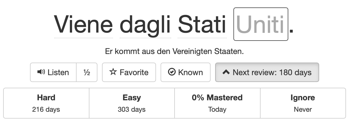
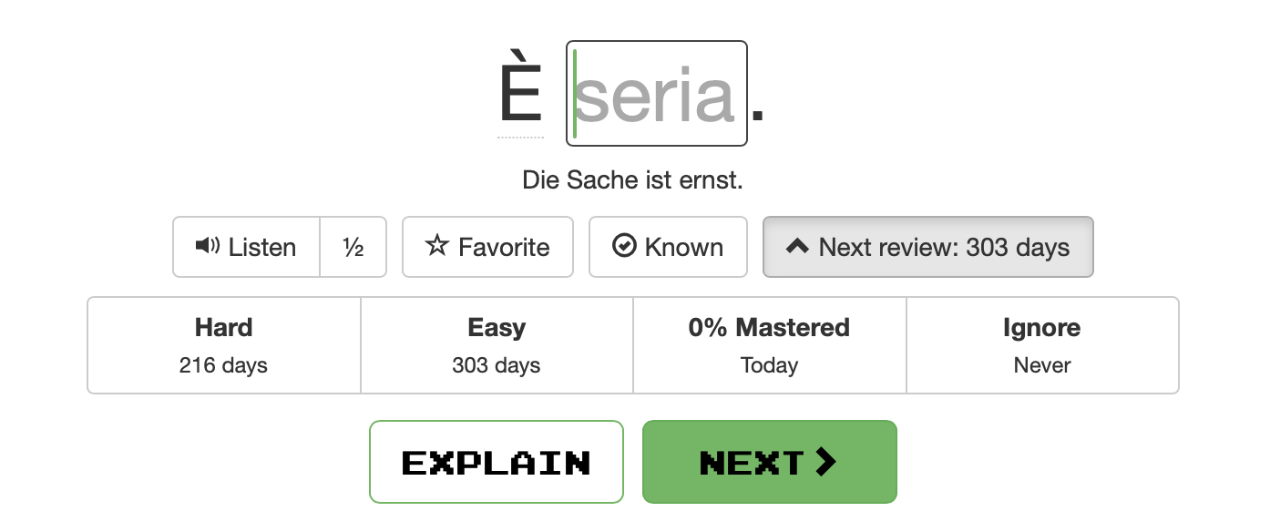
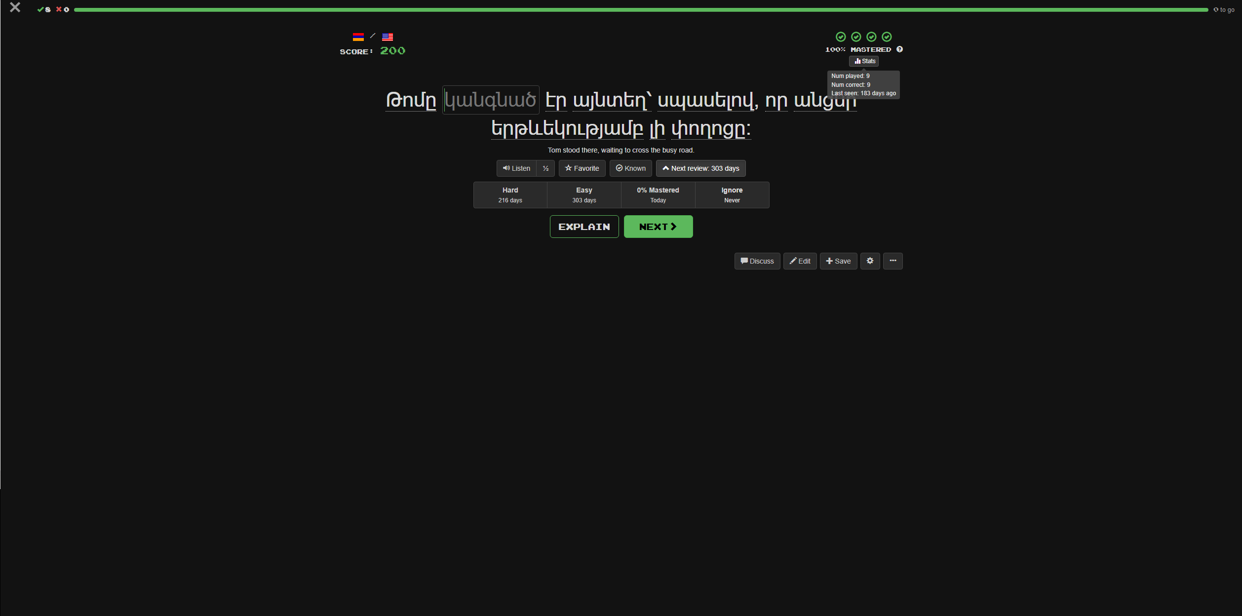
Sorry to slide in here ![]() I have the “Use an always increasing next review interval …” setting on; I’d expect that “easy” (303d) or something between easy and hard (260d?) would be the default, but it’s 180 days. Is this how it’s supposed to work or is it a bug?
I have the “Use an always increasing next review interval …” setting on; I’d expect that “easy” (303d) or something between easy and hard (260d?) would be the default, but it’s 180 days. Is this how it’s supposed to work or is it a bug?
Have post the same question some days before…still no answer…
Hi, I think someone more techy than I will help you more, like @zzcguns or @morbrorper. I’m off now to check my setting for this.
I did get a chance to check the current behavior: normal doesn’t increase the interval but also doesn’t reset it to the shown value.
Full comment here: [Bug about review time? - #4 by blueandnerdy]
As far as I can see, it now claims to do the right thing, but adds the standard 180d. (Ignore if you’re still in the process of fixing it.)
Are there any news on when this will be fixed?