First of all, many thanks for addressing my comment in a separate thread:
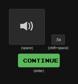
Now the button that meant “Press this button in order to see the ‘eye’ button that you can then press to see the translation” is labeled “Continue”. This provides a nice distinction from the “Next” and “Submit” labels, so thanks!
One cosmetic issue is that the “Continue” label is not centered:
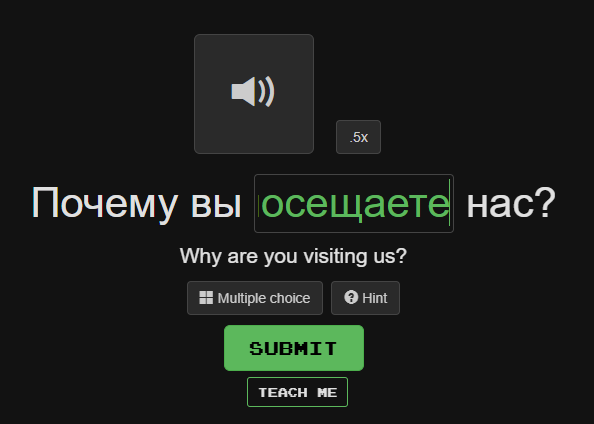
It also looks like the “Teach Me” button is not fully centered with respect to the “Submit” button:
Tiny things, but I thought I’d mention them.