The new SRS controls are broken (ver. 2.8.1)

Thank you @mike and the Clozemaster tech team for continuously improving the programs.

The latest version 2.8.1 was released for iOS this week. I filed a bug report about the transcribe mode three months ago. It has been finally fixed!

However, the new spaced repetition system (SRS) introduced by ver 2.8.1 brought serious (and ridiculous) mathematical chaos.

The web/browser version hasn’t introduced the new SRS, fortunately. Clozemaster, please test it more carefully before releasing a major update.

Here is the summary of chaos:

  1. I personalized my review interval settings, but the new SRS completely ignores them and gives me strange numbers of days.

  2. The down-arrow icon doesn’t deduct the same number of interval days as the system proposed.

  3. The 4-check mark bar on the top right side is not changed after tapping the down/up-arrow icons.

  4. After tapping the down-arrow icon and then the up-arrow icon one time for each, the new SRS doesn’t allow me to go back to the initial interval days.

Below are screenshots for your reference. The example starts from 50% mastered. But I found the same mathematical chaos in other master level cases as well.

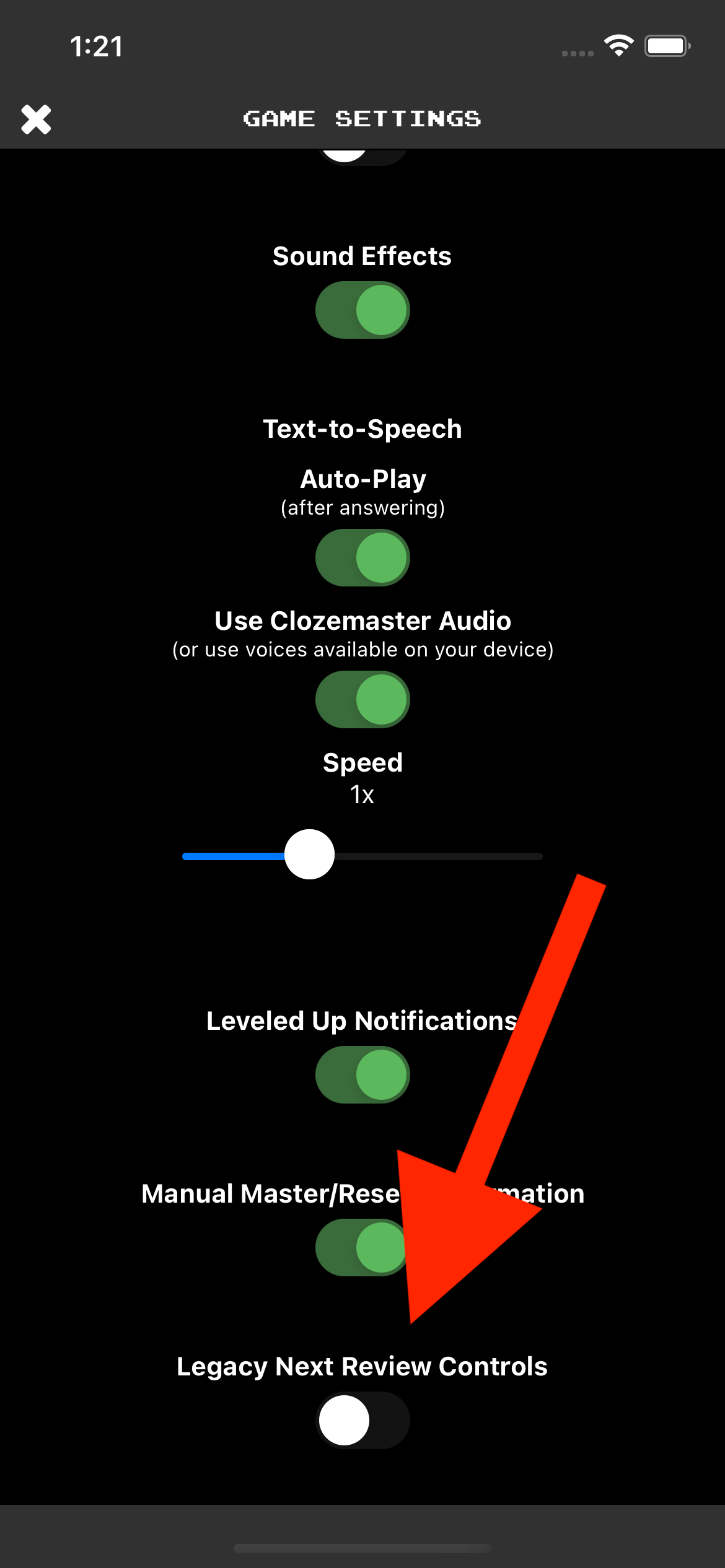
Image 1: The version info introducing the new SRS

Image 2: My personal settings for review intervals

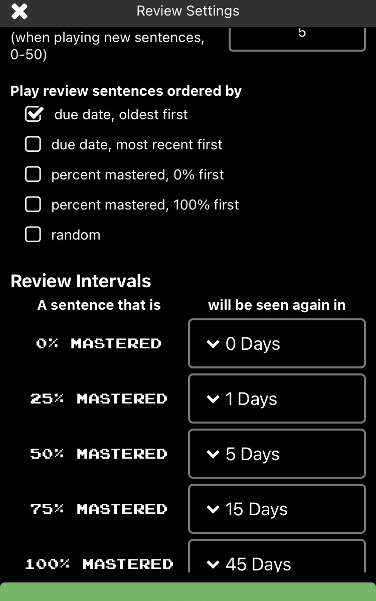
Image 3: A sentence pair right before playing; it’s at 50% mastered (or 2/4)

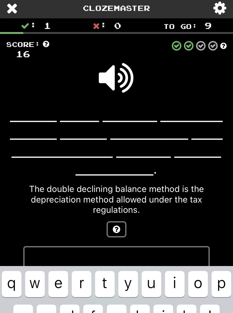
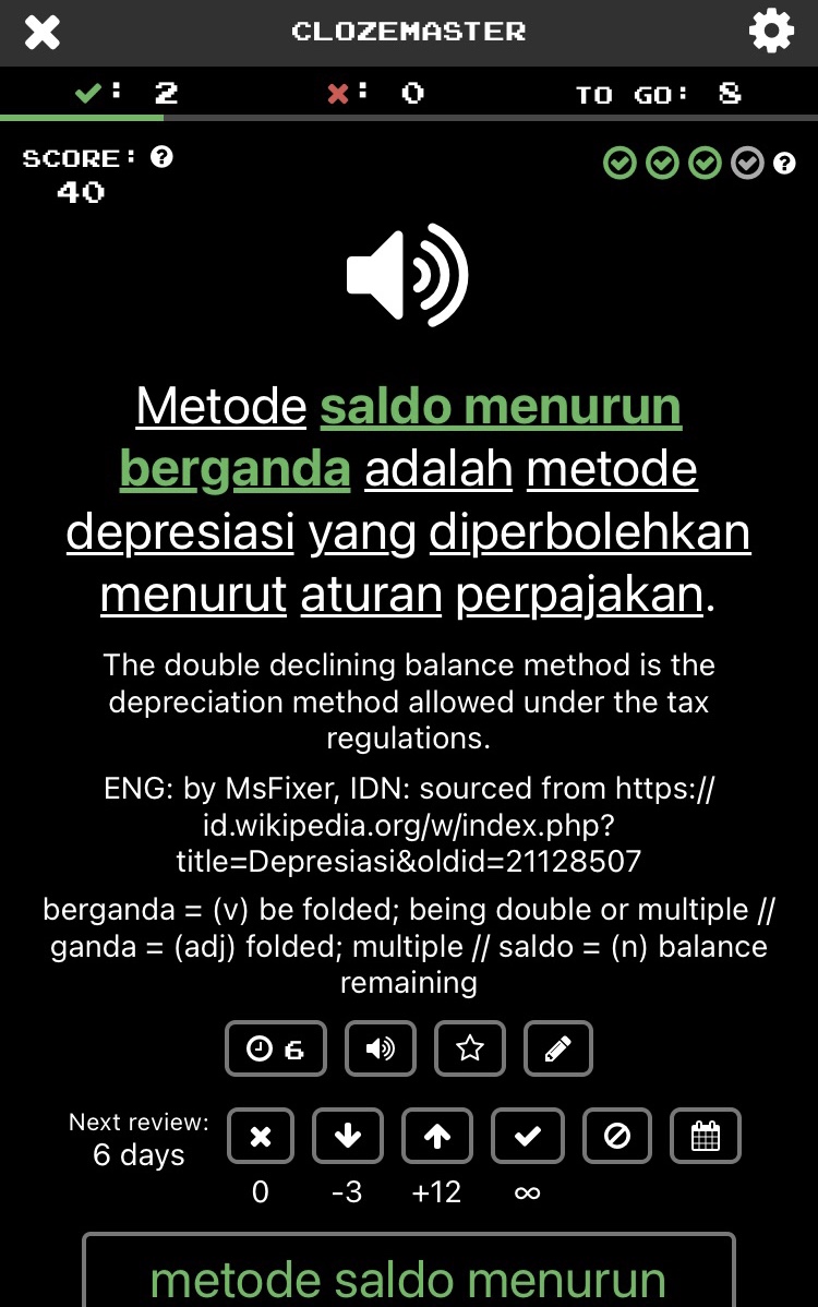
Image 4: Chaos starts here — right after submitting the answer; it’s at 75% mastered (or 3/4)

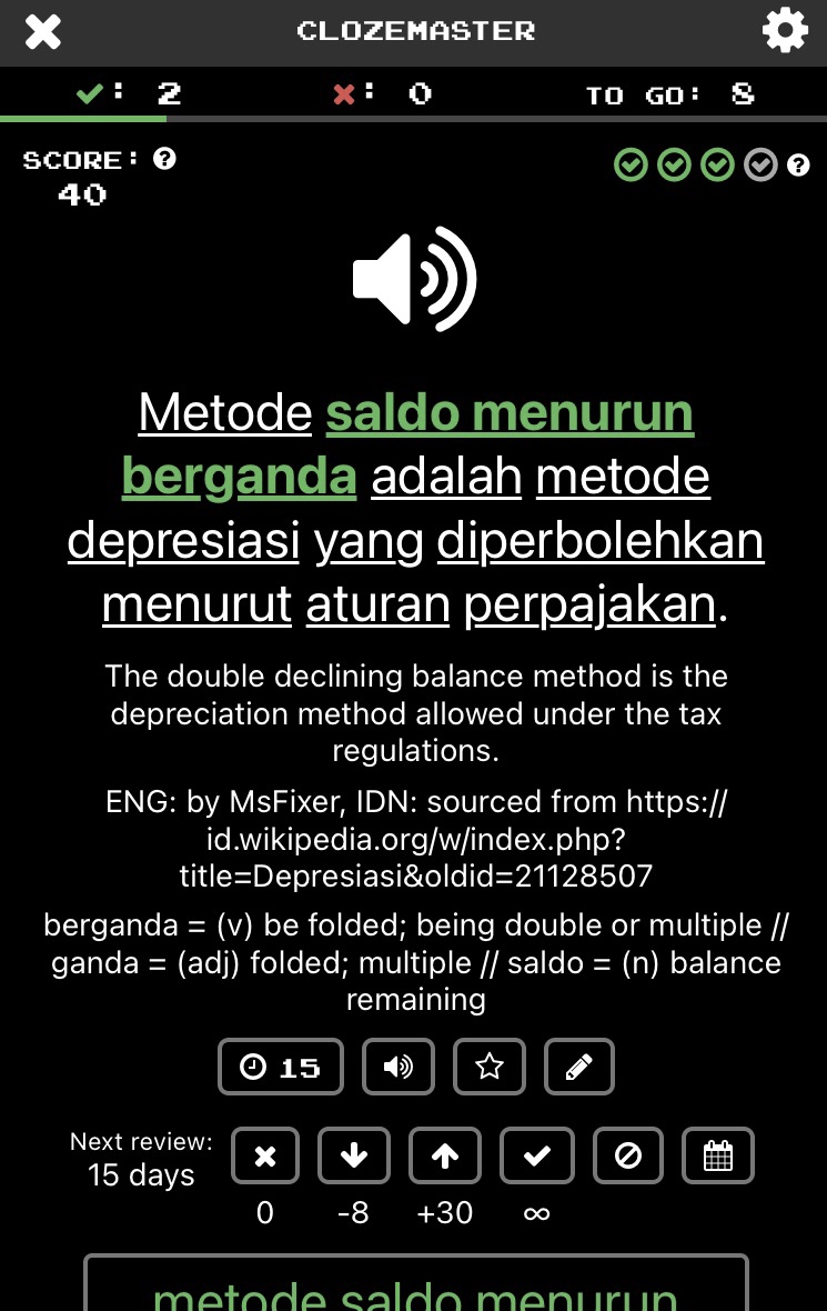
Note for Image 4: The down-arrow icon shows “-8”, which means it would be “7-day interval” for 50% mastered. However, my personal setting for 50% is “5-day interval”. Where does this “-8” come from?

Image 5: After tapping the down-arrow icon to roll back to 50% mastered

Note for Image 5:

  • The 4-check mark bar on the top right side didn’t change from 75% (3/4) to 50% (2/4).

  • The new interval for 50% is now “6-day”. My personal setting is “5-day” and Image 1 notified that it would be “7-day”. But the actual result is neither of them. Where does “6-day” come from?

  • The down-arrow icon now shows “-3”, meaning “3-day” interval for 25%. My personal setting is “1-day” interval for 25%.

  • The up-arrow icon shows “+12”, or “18-day” interval for 75%. But my personal setting is “15-day” interval for 75%.

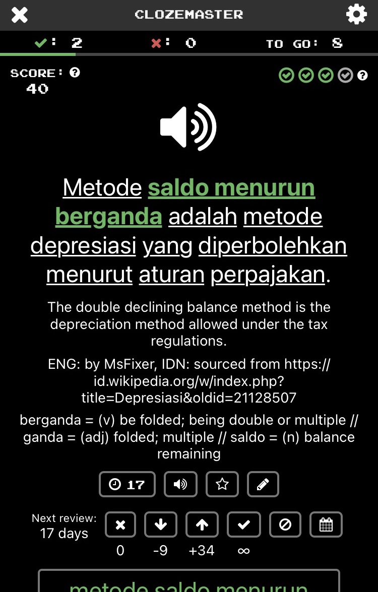
Image 6: After tapping the up-arrow icon to offset and go back to the initial 75 mastered

Note for Image 6:

  • The new interval for 75% is now set to “17-day”. But my personal setting is “15-day”, and Image 6 notified me that it would be “18-day”. “17-day” is neither of them.

  • The down-arrow icon for 50% is now “-9” or “8-day” interval. It should be “5-day” as per my personal setting.

  • The up-arrow icon for 100% is now “+34” or “51-day” interval. But my personal setting for 100% is “45-day” interval.

Image 7: After tapping the up-arrow icon one more time to move forward to 100% mastered

Note for Image 7:

  • The 4-check mark bar on the top right side didn’t change from 75% to 100%.

  • The new interval for 100% is now “50-day”. Wait! Shouldn’t it be “45-day” (as per my personal setting) or “51-day” (as Image 6 promised)?

  • The up-arrow icon should be hidden or disabled because it has already reached 100%. Instead, the up-arrow icon gives me “+100”. Where does this number come from?

So chaotic…

1 Like

Thanks for the thorough post and all the screenshots, and apologies for any frustration!

It sounds like it might be working as intended, though perhaps not as desired. :slightly_smiling_face:

The new SRS controls are uncoupled from the % Mastered. The up/down arrows simply add/remove days from the next review due date. The down arrow halves the number of days from now, and the up arrow doubles it, so if the next review is 30 days from now, the down arrow would remove 15 days and the up arrow would add 60.

The intent of the change is to hopefully provide better control of next review dates on a sentence-by-sentence basis, and make the % Mastered is simpler to understand - it’s simply indicates the number of times a sentence has been answered in correctly in a row.

An additional change is that the button with the check mark now replaces the :brain: “Mark as Known” button - it sets the sentence to 100% Mastered and the next review date such that it won’t come up again. I suspect we might get some pushback here if you like to set sentences to 100% Mastered but still have them come up for review. A note for clarity - the difference with the :no_entry_sign: ignore button is that the latter also removes the sentences from your stats, so it’s as if it was never a part of the collection.

The custom review intervals are still used to determine the next review date after answering.

Here’s the story we had in mind: I answer sentence 1, it was easy, I tap the up arrow to add a couple days. The next sentence, sentence 2, is a sentence at 50% Mastered up for review. I get it right after more thought than I would have liked. I don’t want to reset it completely, but I do want to see it again sooner than my 50% Mastered interval, so I tap the down arrow a couple times. There’s still the option to reset it entirely if I want. Sentence 3 is way too easy, I tap the check mark button so I won’t see it again, but it still counts towards my 100% Mastered count.

Curious to hear what you think of all the above, if there’s anything I might’ve missed or misunderstood, as well as if/where we might try making the controls clearer.

Also! In the game settings there’s a “Legacy Next Review Controls” if you prefer the old controls (or just for comparison) :slightly_smiling_face:

Thanks again!

@mike
Thank you for your quick reply. But I simply disagree with the concept of the new SRS. Sorry to be blunt, but I won’t use the new SRS and stay with the older version even though it sacrifices the bug fix for the transcribe mode.

We had a heated debate on the Wiktionary embedding feature several months ago. You had personally assumed that Wiktionary would be a great reference for everyone. But some people including me articulated that it was just annoying and wanted to turn off.

I feel in the same way this time. Why do you assume that universal halving/doubling should be prioritized over personal settings for review intervals?

Bluntness is always welcome! Thanks for the feedback, and sorry this change was a miss for you. Please also note, and apologies it wasn’t clear in my previous message, you can still use version 2.8.1 with the old controls after answering by going into the game settings via the gear icon top right while playing and turning on “Legacy Next Review Controls” (thanks to our discussion regarding the Wiktionary feature you mentioned, we included a toggle from the start this time :slightly_smiling_face:).

To be sure, the personal settings for review intervals still work exactly the same. These new controls simply allow you to customize the next review date for a given sentence on top of those settings, but you don’t have to use them. You can also tap button with clock icon to hide them altogether.

The change I could see being annoying in particular is that the button with a check mark which previously set a sentence to 100% Mastered now sets it to 100% Mastered and sets the next review date such that it won’t show up for review again. We may change how that button works depending on additional feedback (of course we may change how all these SRS controls work depending on additional feedback :slightly_smiling_face: for example in 100% is not enough!), but that’s the only real change - the other controls are new additional options.

1 Like

@mike
Thank you for your informative instruction on the setting. I returned to the legacy one and I feel much better now.

I’m not a big fan of the toggle for the new SRS. The fundamental problem is that the new buttons are less effective. A solution should not be hiding them but removing ineffective buttons and making the UI/UX neat.

I also would like you to integrate setting pages. As far as I know, one setting is under the “review” section on the dashboard; another can be accessed via the “account” tab; you cannot change the settings for the “play” and “radio” modes before starting them.

The dashboard for iOS is also messy. I propose you to use the tab section on the bottom side more wisely: 1) “learn” (play new + review); 2) “analyze” (stats and leaderboard); 3) “account” (including personal setting). You don’t need the “share” tab. The share feature should be woven into each tab (e.g. sharing stats to show off one’s progress).

On the first “learn” tab, the stand-alone “review” button under the stats chart and its subpage can be integrated into the “play” mode of each collection. There are currently two bars: playing in orange and mastered in green in each collection section. Why do you separate only “review” from each collection?

I have more comments on UI/UX but the abovementioned points are already enough, I guess. Hope my candid opinion is not so overwhelming.

1 Like