This is a description and review of the new V5 dashboard that is part of the proposed user interface changes.
The new Version 5 dashboard is greatly simplified from the current version. In keeping with the video game theme, the background now has a green mesh perspective grid. Note that I play in dark mode, so I can’t confirm how any of this looks in light mode. Also, the Dashboard/Collections/Cloze-reading options on the left side have been moved to the top of the page, and the dark mode on/off button has been moved under the user accoung pull down menu on the very top right of the page.
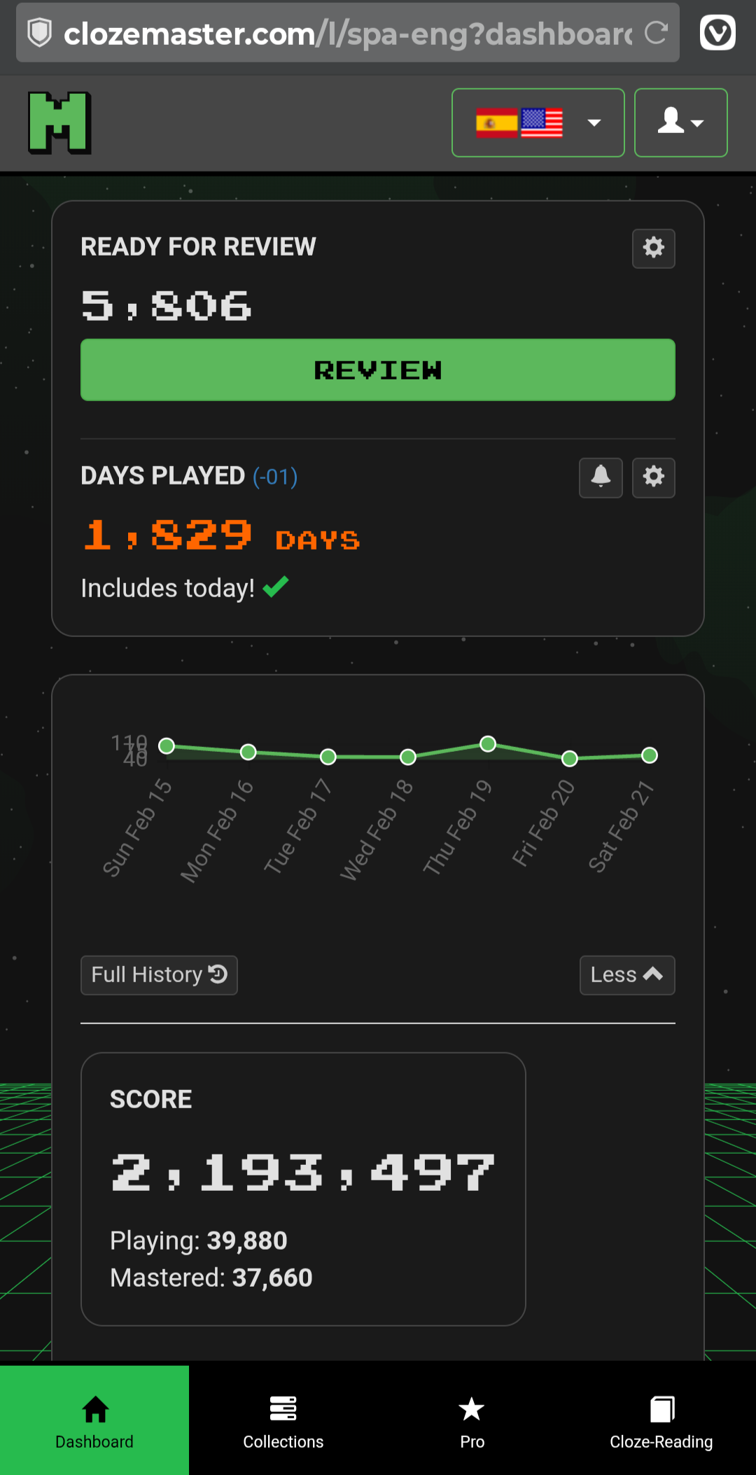
This is an example of the new interface -
There are 4 elements to the new interface -
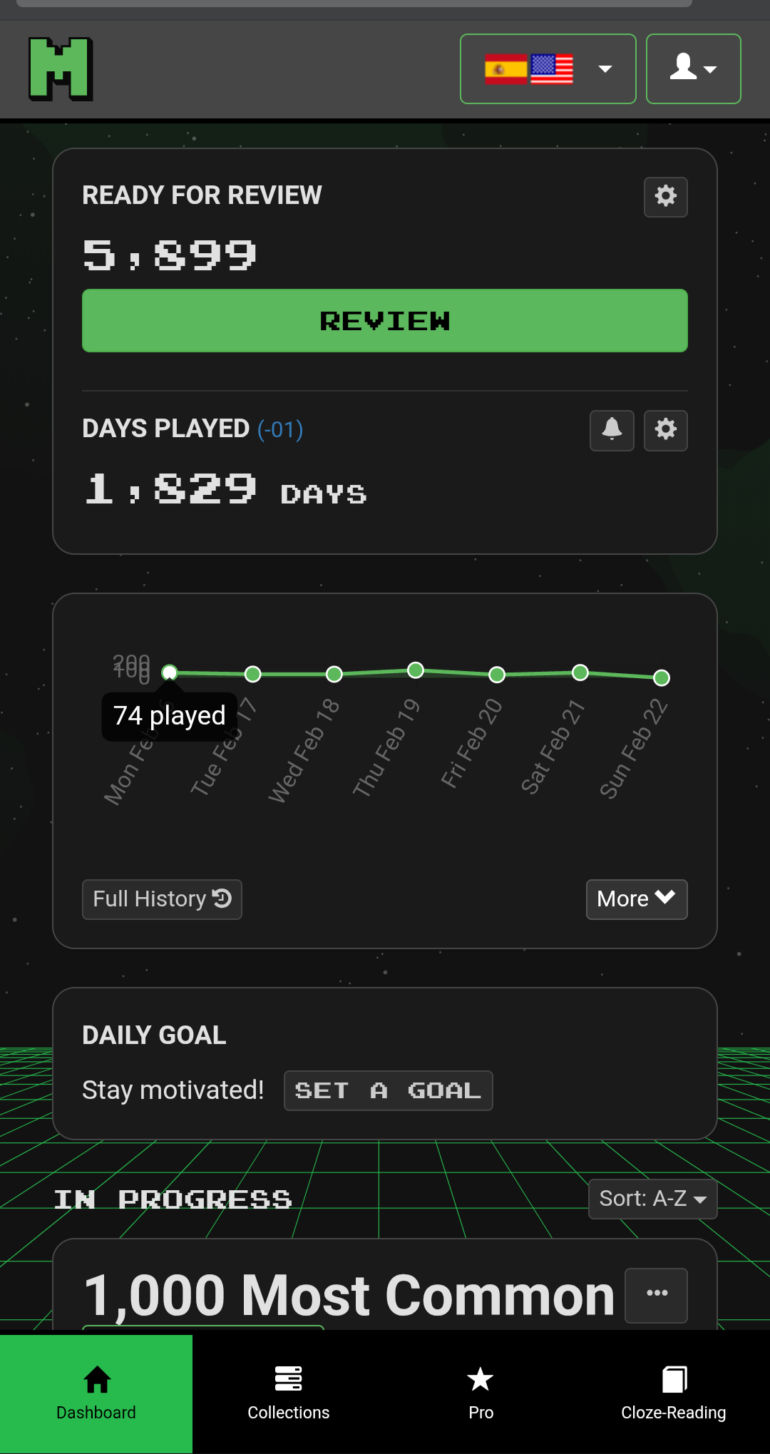
- A top frame with “Ready for Review” and Days Played (for anyone who has the option for streaks instead of days played, they may have a different entry in the top right frame).
- A graph of sentences played over the past week, together with an important “More” button.
- Daily Goal
- Collections currently being played.
I’ll discuss these individually.
Frame 1 - “Ready for Review” and Days Played (or streaks)
I don’t personally have any interest in my days played, but otherwise I don’t really have anything to say about this frame.
Frame 2 - History Graph (and “More” button)
The history graph has changed from the old version, and I note 3 main differences -
- The most obvious change is that it is now no longer a smooth curve, but for me that is just an aesthetic change.
- The previous graph was actually two graphs, one for new sentences (green) and one for reviews (blue). The two numbers are now combined into a single number of sentences played.
- The scale has changed, and it has changed in a way that I consider to be a bug.
So for point number 2, I like the idea of seeing a single peak for how many sentences I have played. The old way with two overlapping curves made it difficult to compare days, as new sentences and reviews would overlap. My ultimate preference would be to still have the two things separate but as stacked (cumulative) curves, but this change is already an improvement in my opinion.
For point 3 there is a major problem. I’ll illustrate it with my Turkish sentences/reviews.
Here is the old (current) graph -
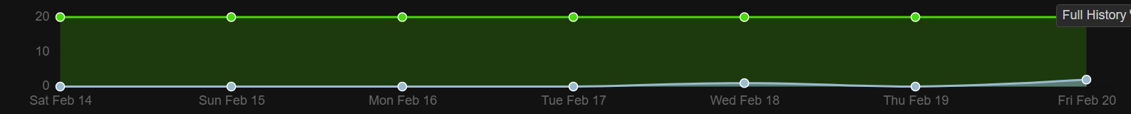
and here is the new V5 graph -
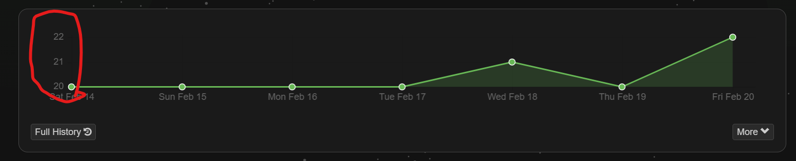
The scale on the graph has now changed to be a minimum/maximum number of sentences played. I played 20 sentences per day all week, and on 2 days I had to review 1 or 2 sentences. I expect to see a graph very similar to the current version with a minor kink or two, but the new graph is (in my opinion) totally distorting the data.
I would therefore strongly suggest that this graph needs to be changed to have a baseline of zero in all cases.
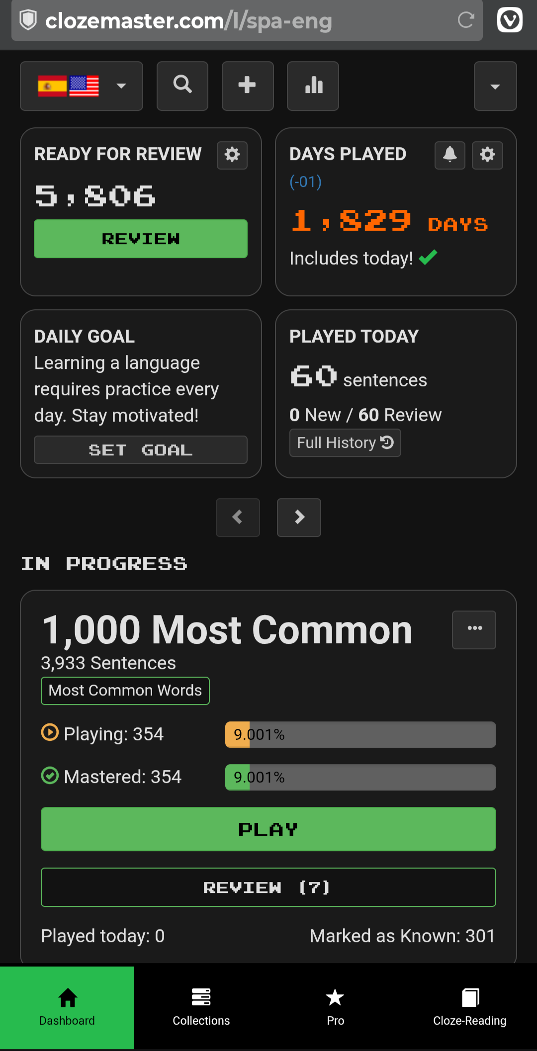
Frame 3 - More Button
So where did all the other stuff on the old interface disappear to you might ask. Well, that’s where the “More” button comes into play. If you click on the “More” button it changes to be “Less” and the old stuff reappears like so -
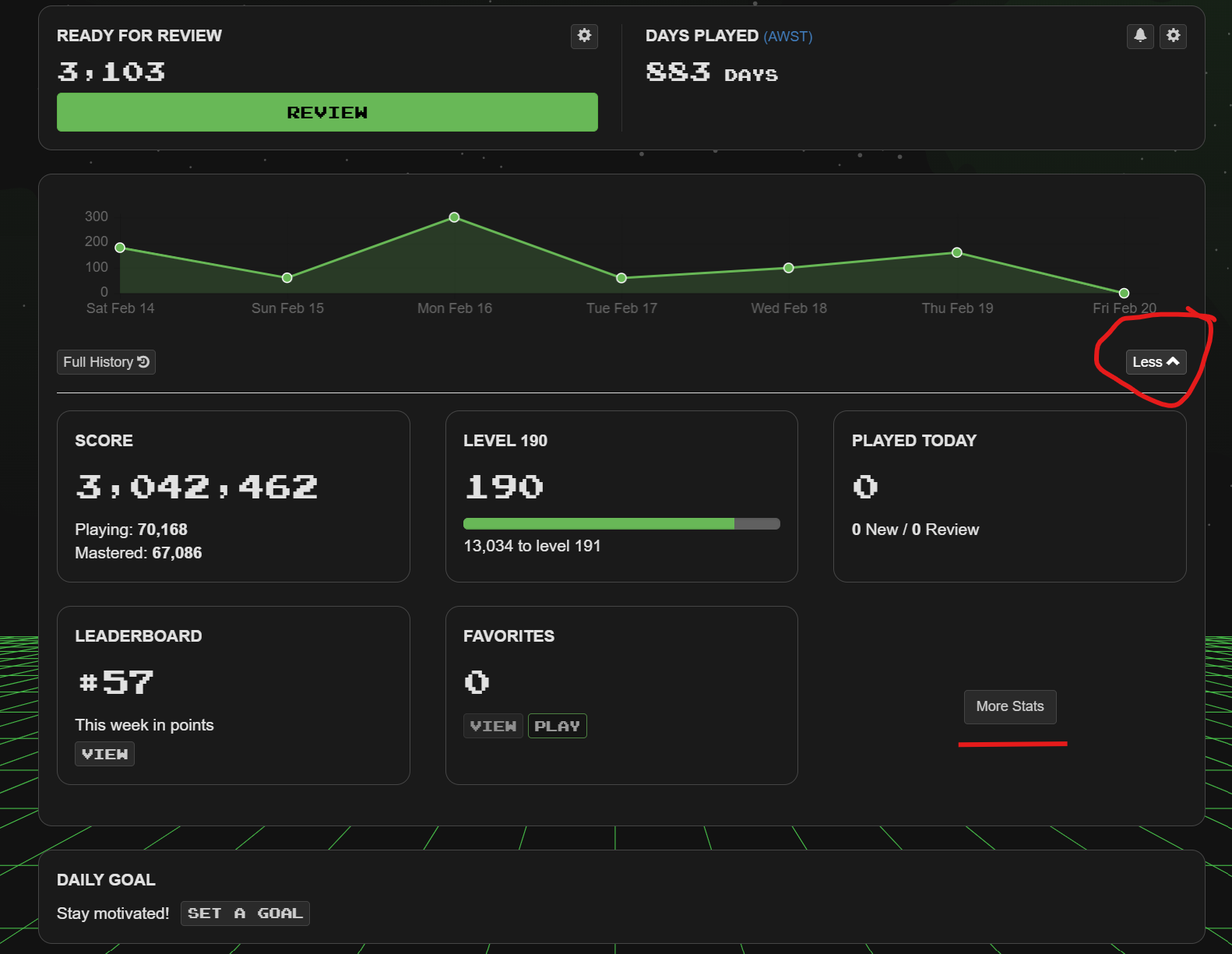
Note also the “More Stats” button. This is the replacement for the little “Stats” icon (at the top of the page next to the magnifying glass and plus sign) on the current interface. I personally use the Stats icon quite often, but it doesn’t seem to be too big a burden to have to click twice instead of once to get my stats fix ![]() .
.
The main problem I have though with this “More” button, is that it isn’t obvious to current users that this is where things have moved to, and what “More” means in this context. Maybe this button could be changed to be labelled as “More Gaming Data” and then “More Stats” relabelled as “Stats and Graphs” or something more meaningful.
I would also say that “Favorites” is totally out of place hidden in the data and stats section. Personally, I would strongly suggest that “Favorites” should replace Days Played (or Streak) in Frame 1 of the new Dashboard )but I realise that I might be in a minority here given the number of people addicted to their streaks ![]() ).
).
Frame 3 - Daily Goal
This frame serves absolutely no purpose for me, and I consider it clutter on an otherwise clean interface. I don’t want to set a daily goal. I don’t want this frame sitting in the middle of my interface.
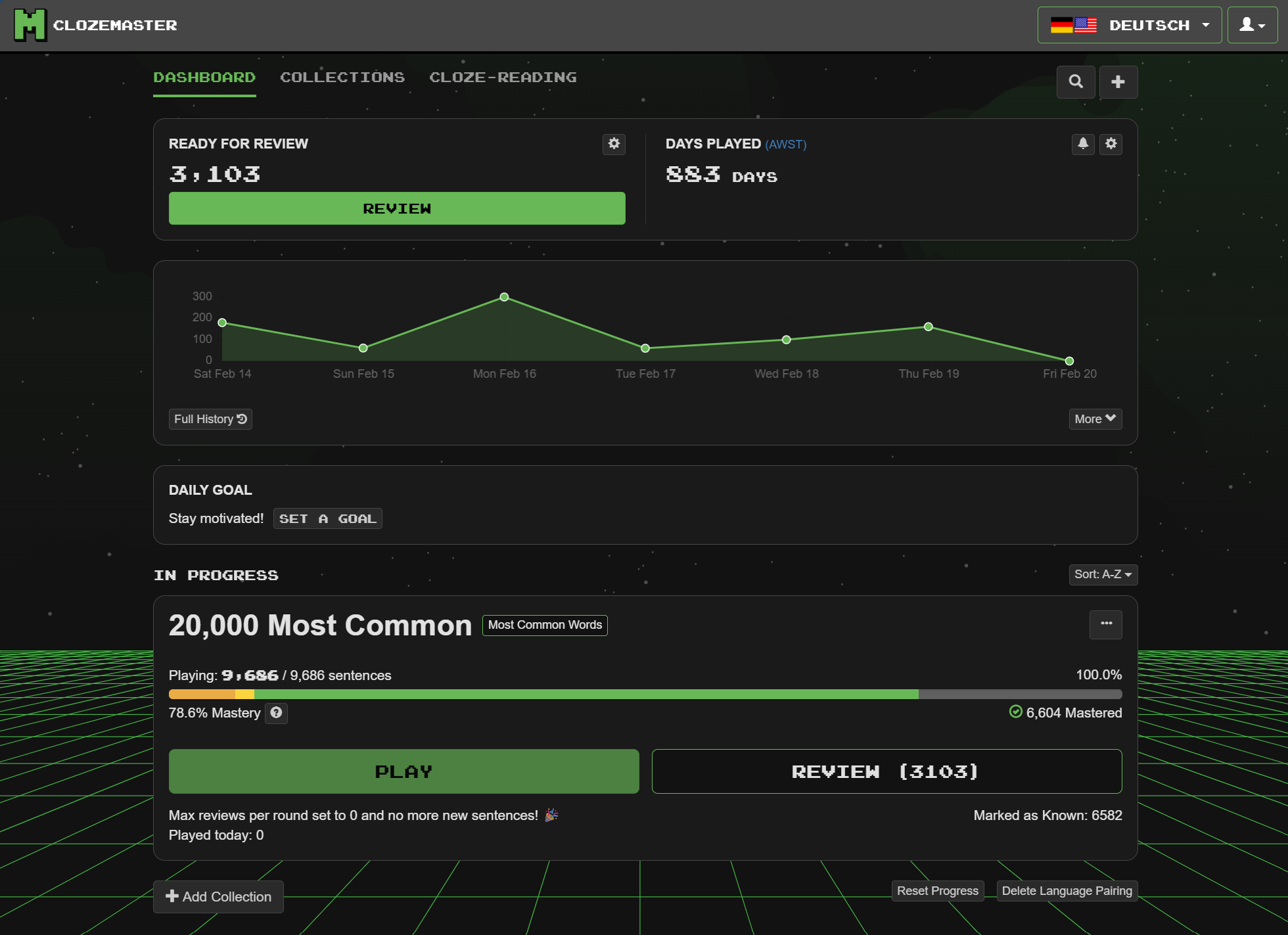
Frame 4 - Collections
I see two changes to the collections section.
The first is a sort option for the collections as shown here -
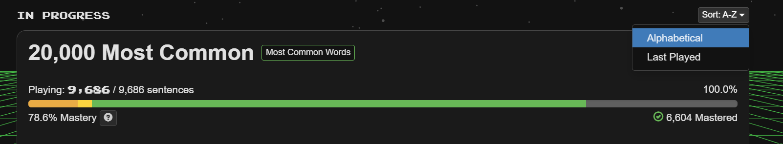
So you can now choose from two options for how you want collections sorted. I wonder if it would be helpful for some people if this could be extended to other options such as “Last added” (i.e. last added to dashboard), “Most reviews” etc.
The second change I see is to the coloured bar marking progress -
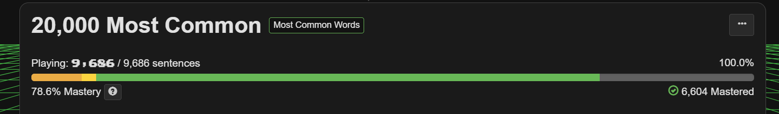
The current systems uses one bar in orange to indicate the number of sentences being played, and another green one to indicate mastery.
The new system uses a single bar, and has different colours for 25%, 50%, 75% and 100% mastered along that line. Note that the line lengths are not directly proportional to the number of sentences being played at that percentage. The lengths of each line section are scaled by their percentages, so a line section representing 100 sentences at 25% completion would only be one quarter the length of a line section representing 100 sentences at 100% completion.
The combination of these numbers then gives the “Mastery” number. In the case of the image shown above, if I click on the “?” next to “Mastery” I get an explanation as shown in this image -
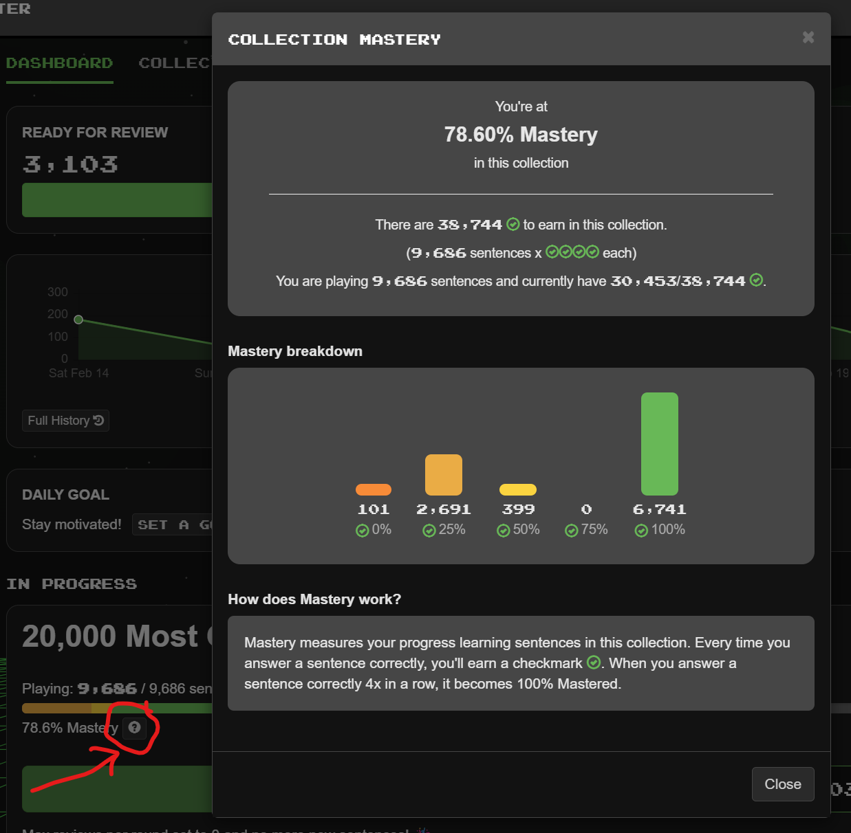
You can also hover over any of the line elements, and it will give you details of how many sentences that line section refers to as shown here -
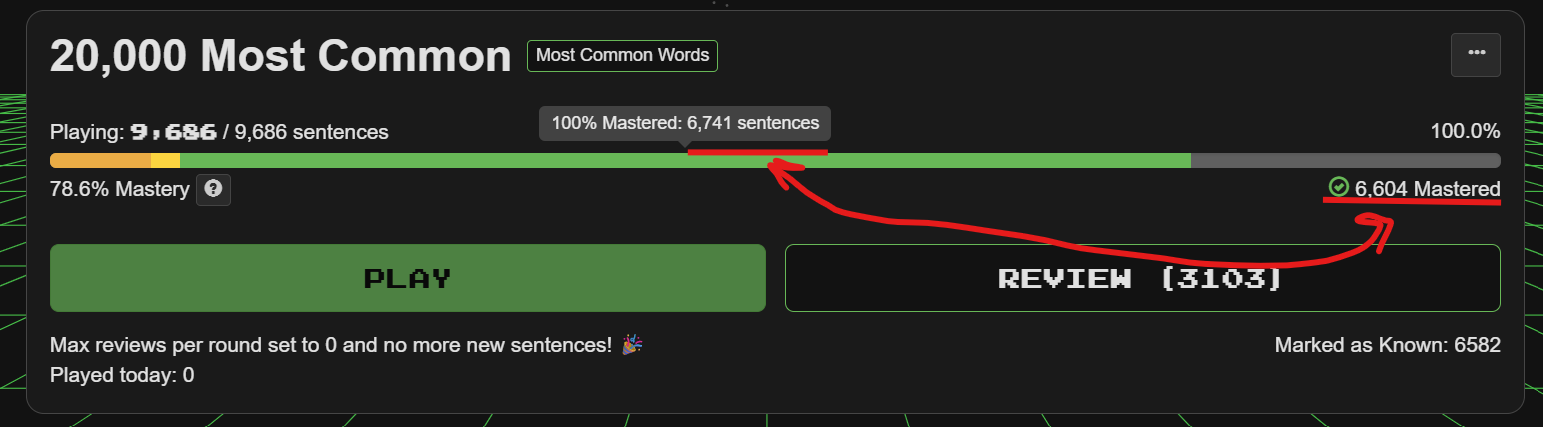
So in this case it states that for 100% mastered I have 6,741 sentences in that line section.
Note also the mismatch with the “Mastered” sentences reported below the line. This is a bug, and is due to the fact that the line segments are including ignored sentences.
This bug is also easily seen if I look at a different collection which I have played to full master - in fact I have played to beyond full mastery ![]() -
-
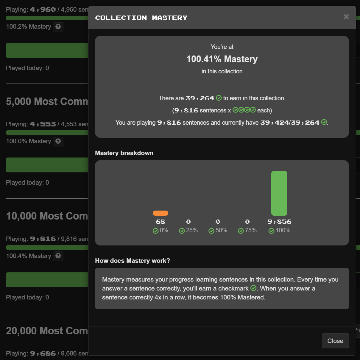
In the top frame it states that I can earn a maximum completion from 9,816 sentences, but in the next frame it states that I have 9,856 complete, which is 140 more than “maximum”. These extra sentences are ones that I played to 100% completion and then set to “ignore”.
Hence, that should be a simple bug to fix.
My thoughts on the graph are that while I understand the idea behind this “Mastery” figure, I would prefer to have the line sections not be scaled. I have no issue with the number, and it is a nice additional metric, but I would personally rather see at a glance the relative proportions of the percentages complete, and this isn’t easy to see with the current scaled line segments.
Conclusion
Overall, I like the new dashboard, I like the simplification, and the addition of a few new features. There are one or two simple bugs to fix, but overall I consider this to be a positive change.