Ps I also have to change voice speed and mode every time I log into mobile phone app. The interface is far too big for the screen. Half gets hidden. So annoying. Have again raised this with Mike&Team as paying for something that’s not working properly is somewhat annoying. Also annoying, for me at anyway, is the Hint symbol and Multi Use symbol being on the left - why!? Even Multichoice is too big, too spread out. Rant over for today.
Just had a star rating pop up for Clozemaster - I’d so love to give it the full five as I used to. Still hoping …
4 Likes
So it’s back to P mode for Hard/Txt but once again with floating keyboard which kind of takes your eye and fills the enormous gap between answering and the green Send or Next way down at the bottom. Landscape/Easy cumbersome but better than nothing.
1 Like
Hello? Is there anybody out there…? Is there any chance you guys fix the issues that we have brought to your attention?
1 Like
@GabriDae thanks for the bump and sorry for the slow reply! Work in progress!
It’s an attempt to simplify it / make it less confusing. It’s gone just ok so far.
Which do you mean here?
Which device/OS are you using? Assuming Android.
Do you mean it’s not remembering your last selected play options, or something else?
Any other feedback/issues please let us know of course. If you’d be up for a Zoom call to walk through how you use the app please let us know too.
@Floria7 does “P mode” = portrait I’m assuming? Might you be able to post/send a screenshot or screen recording of the issue you’re still having? Thought we might’ve whack-a-mole’d it in 2.11.6, but perhaps we misunderstood. Also please note the app is built for portrait, landscape not so much so far as you’ve noticed.
Just to note; Full explanation was sent to the Team. I think we just have to accept that Landscape is now impossible on Galaxy tabs without lots of kerfuffle. It worked perfectly before, it was clear, concise, easy to use … now long gone it seems. Ah well, will try to work round it as I recently paid my sub;-) Finché c’è vita, c’è speranza!
I disagree, it seems crowded and inneficient now.
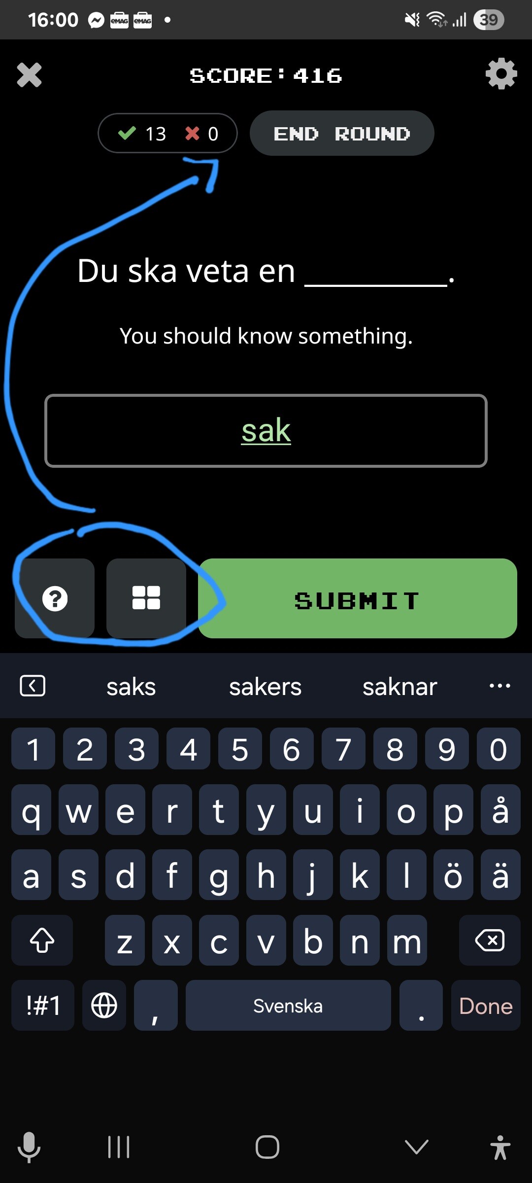
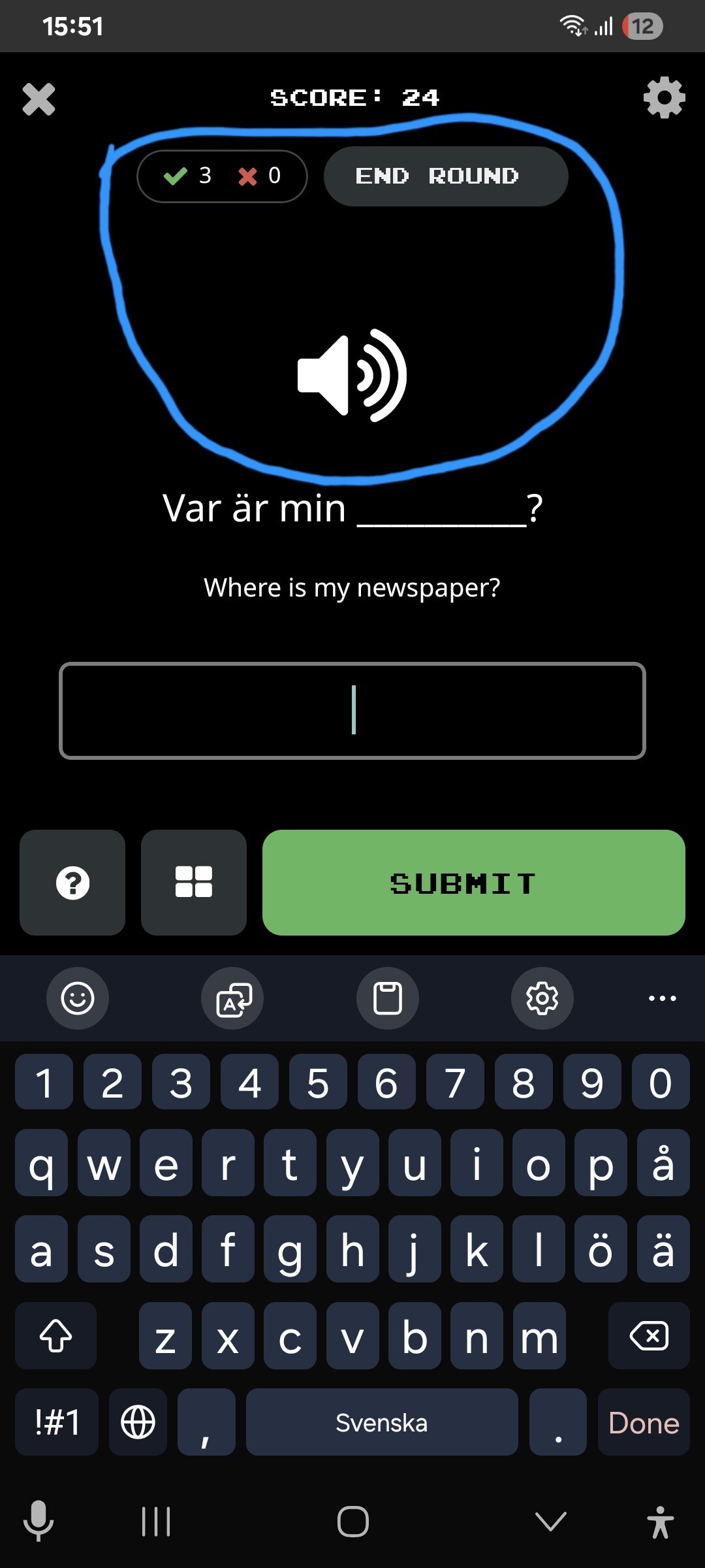
The SUBMIT button is located to the right of the screen now. There are two icons to its left. (? and ■)
What is the point of moving them to the left of the SUBMIT button? Why can’t they stay above it? This is what bothers me the most about the new layout, I think that the SUBMIT and NEXT buttons should stay as they were, without any icons to their left or right.
Right now the NEXT button has a clock icon to its right. I think this icon is unnecesary and I touch it by accident with my right thumb when trying to hit NEXT. Can we please get rid of it or at least make it possible to remove it individually (from Game Settings)…?
Exactly! I have to exit the game and start over.
I use Android.
Sometimes, when I try to type the answer I see that the box is located too low and I have to “retrieve” it. This interrupts the flow of the game.
My suggestion is to keep the SUBMIT and NEXT buttons without any other icons next to them (left or right). And for them to be wide (not narrow) because it is easier to play that way. Like I said, muscle memory plays a huge role in how each of us play. I just got used to touching these buttons (SUBMIT and NEXT) with the right and left thumbs.
The way things are right now, the location of the SUBMIT button (the right of the screen) forces me to play with my right thumb. Likewise, the location of the NEXT button makes it difficult to play with the right thumb and forces the user to touch the screen with the left thumb. It limits the freedom of playing.
I imagine things get even more complicated for left-handed people.
If the two buttons are wide and remain “independent” then playing the game is more comfortable.
2 Likes
Thanks for clarifying! Understood now. Good points. It’s also a change with respect to the “Next” button being sticky above the keyboard when playing text input whereas it wasn’t before / it was fixed beneath the text input. Perhaps it should be re-fixed beneath the sentence, the bummer there though is having to scroll to see the submit button if it’s behind the keyboard. Will see what we can come up with. Thanks again!
@mike
Or you could leave the SUBMIT button above the keyboard but move the NEXT button in the exact same place. (If this is not possible then place them both at the bottom)
Here is how I would make the layout:
- Move the ? and ■ icons above the sentence
- Move the NEXT button in the exact same place that the SUBMIT button is
- Move the EXPLAIN bar under NEXT
- Finally, at the bottom of the screen there are informations about % Mastered
1 Like
Thanks for all this! Super helpful. Quick question to confirm - do you usually tap the “Submit” button when playing text input vs the “return” key on your keyboard?
2 Likes
I usually tap Submit, but recently (after the change) I found it somewhat tiring and distracting to constantly switch between the middle and the bottom of the screen (where Submit and Next buttons are).
So I started hitting Done instead of Submit, but that didn’t work either because after pressing Done (bottom right corner of the screen) you get to the second page where you cannot press the exact same place for Next because that place is occupied by the clock icon.
That is why I recommend to keep the Submit/Next buttons wide and on the same level of the screen.
That way you don’t have to keep thinking what place of the screen you have to touch, plus it makes playing smoother and more enjoyable.
1 Like
Hello!
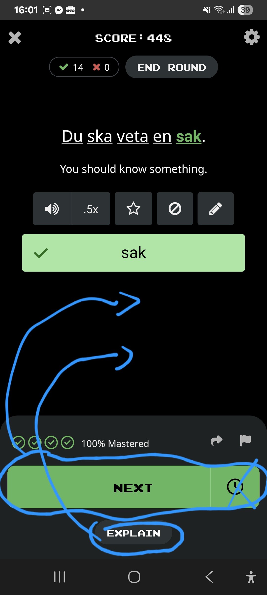
I just noticed that there are two tabs that have the same function, namely X and END ROUND. This clutters the screen unnecessarily so I suggest to only use one of them.
Having thought about it, I think it’s better to keep the “?” and “■” tabs under the answer because after pressing “■” you get Multiple Choice that unfolds right beneath this icon. It is more visually coherent that way.
Also, another suggestion is to keep the answer on the same level after hitting Submit. At the moment it drops a little on the second page.
Thank you for listening and for being so open and receptive, @mike
2 Likes
Old habits die hard, however I’ve only tapped the wrong Green box twice recently, so we’re on the up;-)
1 Like
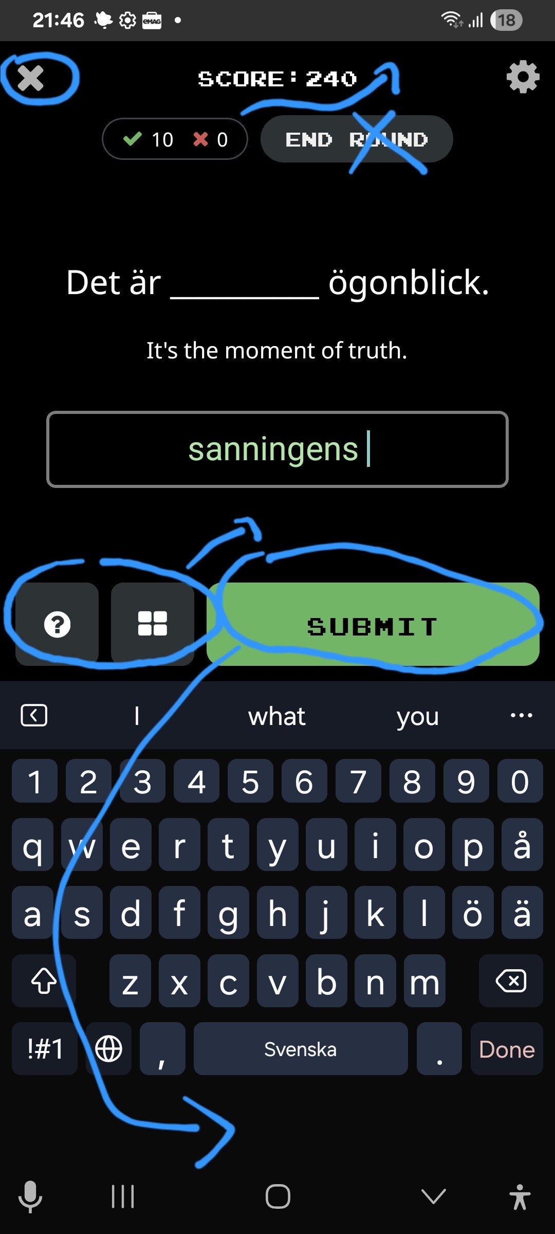
The challenge that I see with the new layout is that I have to scrolle up before I can see what I am typing because the box is covered by the keypad. And what makes it worse is that when I submit my answer, it stays up so I have to scroll down to see the full sentence with the cloze filled in.
I used to use the mobile app a lot, but I am using it less now because of this. I realize this might not be a common issue (I have a smaller phone than most people - iphone 13 mini), but I also very much would like that we type directly into the blank and not to a box below. That would solve this problem. Thanks for considering it, @mike.
2 Likes
Hi Paris2020…I’m with you here, I’m constantly typing blind on phone and tablet, the popup keyboard and new layout is not a patch on the “old” set-up. I continue to work around it tho as I’m a great fan of ClozeM and value other learners here, but hey it’s not easy:-/
1 Like
It’s a bummer, but I too am persisting, mostly on desktop and only using mobile app when I have to. It seems to work fine on ipad, so I am using that more.
I agree it’s a valuable tool and the community is so very supportive. Good luck!
1 Like
Same here! It’s frustrating playing now…
The reason we have to constanly scroll to see the answer is because the sentence was moved too low from where it previously was. Look at all this space (in listening mode) that drags the sentence down. It should be noted that I use the smallest font now and I moved the keyboard the lowest possible just to be able to see what I am typing. But this still doesn’t work for longer sentences.
1 Like
Ah, ok. I thought it was because my phone screen is small. I really hope they change the design to remove all that space at the top, or better yet, let us type directly into the blank space the way it is in the desktop version.
2 Likes
Just to add, with a touch of wry humour, that even on Portrait, certain long sentences need much manoevering to fill in the word and Send. Two humdingers from Italian-from-English are re “La Vegas and the slot machines” and “Aspettiamo con gli asini…” So stai attento, be careful of both the slots and the donkeys:-)
However, a “grazie mille” to @mike for the new Italian Collections, particularly the Imperfect Subjunctive, always appreciated.
2 Likes