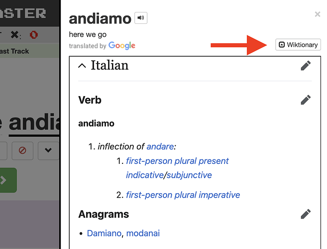
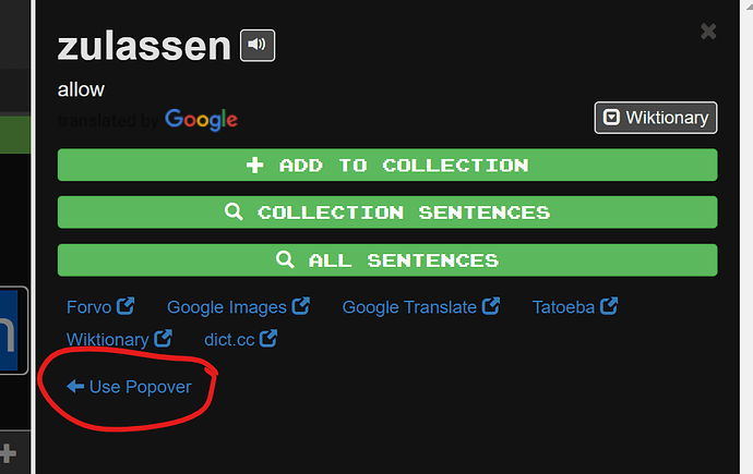
That’s helpful to know - thanks! It is indeed toggle-able:
Makes it smaller - but still annoying ![]()
I didn’t realize it could be shrunk, though there doesn’t seem to be an option to turn the feature off altogether. I need to work with it for a while to decide how I feel about it.
@galning @alanf_us I’m not sure I understand - it should be an on/off toggle. What browser are you using? Might you be able to post a screenshot?
I understand @galning and @alanf_us ‘s sentiments. The old pop-up version works for me better than the new one. I’m on Win10 x Chrome.
The new pop-up even reminds me of the terrible Microsoft Excel “F1”. When I try to push “Escape” key, I sometimes push “F1” key accidentally. And then, the long unreadable Excel Help window pops up and consumes a quarter of my screen on the right side. I’m probably suffering from PTSD due to Microsoft. I really want to disable F1 on my Excel.
I would like to give @mike two possible best practices for a benchmark purpose: 1) Wikipedia’s mouse-over preview function, and 2) iOS look-up function.
You can see the screenshot and professional review on the Wikipedia’s functionality here. This preview function enables users to quickly skim the overview of linked articles without clicking the link during a target article. — For example, you are reading the “Orange” article and it says “contains a lot of {{Vitamin C}}”. A summary of “Vitamin C” article is popped up when you mouse over the term {{Vitamin C}}. This function saves one’s time. Unlike Clozemaster, the Wikipedia’s pop-up doesn’t occupy a quarter of my laptop screen. It can be set on/off from a user account console.
My iPhone x Safari gives preview of 4-5 different dictionaries at once when I (as a Japanese native speaker) am reading an English online article and push an unfamiliar word for a second. Two are usually from English-English dictionaries, and the rest is from English-Japanese. On the other hand, the new Clozemaster pop-up doesn’t function as an overview of all possible references, and an unreadable etymology part of Wiktionary is always given the highest priority. The approach doesn’t respect differences of user’s choices.
My point is each language has totally different popular/major dictionaries. Wiktionary cannot assume the role of “one-size-fits-all” solution across all language courses. But the Clozemaster’s new feature occupies a quarter of my screen horizontally even if the toggle is on and it makes vertically smaller. And the new pop-up is located far from a target word. A pop-up, in general, is supposed to be a small preview near a target word. It doesn’t fit the current user interface trend. I think the new feature is optimized too much for Wiktionary and sacrifices general usabilities.
For me, Firefox 99.0.1.
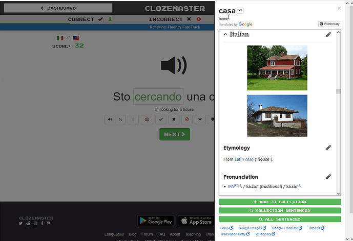
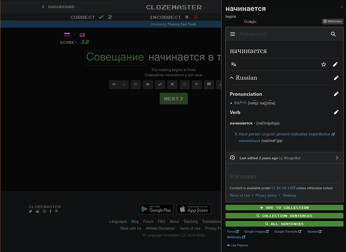
This is what you get when you select a word; I agree with @MsFixer, it’s annoyingly large and on smaller screens it obliterates a large chunk of the sentence (including the word in question here).
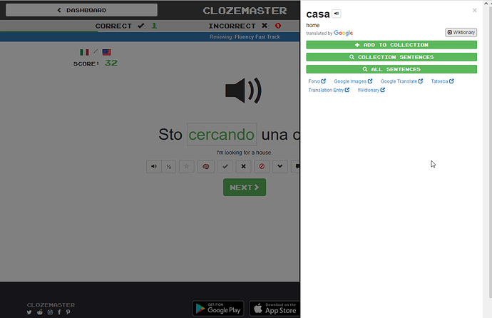
Then if you click on the Wiktionary button, yes, it will shrink down the Wiktionary entry as well as the Google Image search if applicable, but you still end up with as much as a third of your screen and a substantial chunk of the sentence obliterated which is a pretty high visual price to pay for 6 links.
I just wanted to quote that because there is not a single clause in there that I could conceivably agree more with.
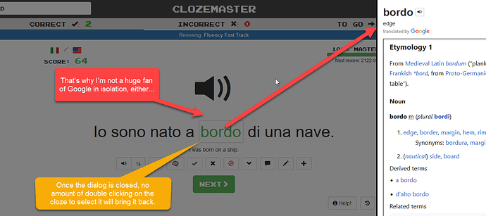
Incidentally, for me at least there is another bug. You can click on most of the words to bring up the pop up as many times as you want, but (double) clicking on the Cloze word to select it and bring up the popup now seems to be a one shot deal. Once you close the popup, you cannot get back to it no matter how many times you click on the cloze.
If there’s a vote mine is for the restoration of the old pop-up. It’s not perfect but… it’s better than this one for all of the reasons that MsFixer gave.
I’m using a PC with Windows 10 / Edge and get the same as you. The toggle gives me the same as your 2nd image.
it’s just really annoying that I’m trying to copy/paste and it’s constantly popping out, even when i have no interest in using it. ![]()
It’s not shrunk, as such, though. It just hides some of the text and leaves you a white panel. So a third of the screen is still eaten up.
I’m probably just “awkward” but i have a PC with 2 large screens and like to have multiple things open at once. I use Edge for Clozemaster / Duolingo (shhhhhhh) but then Chrome opens a bunch of favourite dictionary / grammar sites (which don’t include Wiktionary). Plus Excel, to make notes into.
I like using 2 diff browsers just because the visual (of the coloured logos) on my System Tray makes it easier to flip around quickly.
So I don’t want a dictionary launching in Edge, which is the one my lessons are in.
We all have different ways of working and other people, using other devices, may like this pop out.
It’s too early for me to judge the pros and cons… but in general, I often need to know word origins (etymology) in order to really commit words to memory. Often i need to go searching on the web to find it. So a handy link to Wiktionary should, in theory, be useful…
This appears to be a Firefox thing. On a different computer I’m still getting that issue, but on Chrome 100.0.4896.127 64 bit you can call it up for the cloze word multiple times as well.
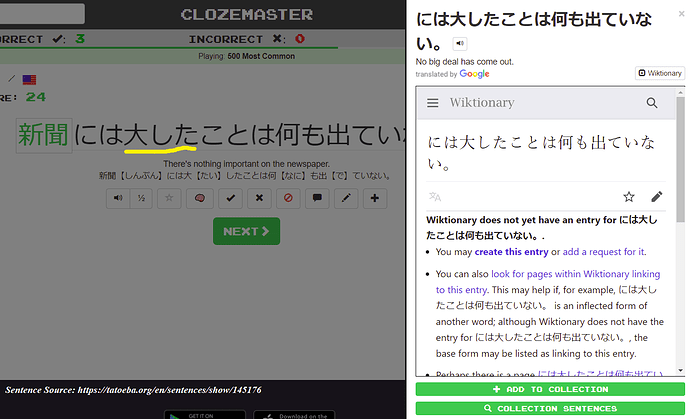
Let me additionally give you an example how the “page not found” issue happens. Here is a screenshot from the Japanese from English course. As I explained earlier, Clozemaster fails in lemmatization in an agglutinative language. Chinese and Korean also don’t split each word by space, so they probably have the same issue.
The example sentence means:
No big deal is published in the newspaper. (Note: robotic word-for-word translation just for discussion)
I clicked 大して (adjective/adverb meaning “big”). But Clozemaster just splits the sentence into two: the cloze-word 新聞 (newspaper) and the rest of the phrases. This means Clozemaster recognizes “nobigdealisrevealedinthe.” as one word.
The correct split should have thirteen parts, not two:
新聞 (newspaper) / に (particle equivalent to “at” in English) / は (another particle) / 大した (big) / こと (things/deals) / は (particle for a subject) / 何 (anything) / も (particle) / 出 (go/exposed/published) / て (particle) / いな (not) / い (present tense) / 。(Japanese period)
On top of that, the pop-up doesn’t work properly even for cloze-words due to the conjugations. Former several course takers complained about it two years ago here.
The minimum unit of verb in the abovementioned example is 出 followed by a particle て, but the root word (lemma) is 出る. So, all conjugated forms such as 出て (go and then), 出た (went), 出ない (don’t go), 出たら (if go) etc. should be all categorized into the same word family. Without this data processing, the pop-up doesn’t work for agglutinative languages. And I understand it’s very challenging.
The old pop-up simply returns results from Google Translate even if Clozemaster’s lemmatization is awkward. That’s enough for agglutinative languages.
Me: googling “agglutinative” ![]()
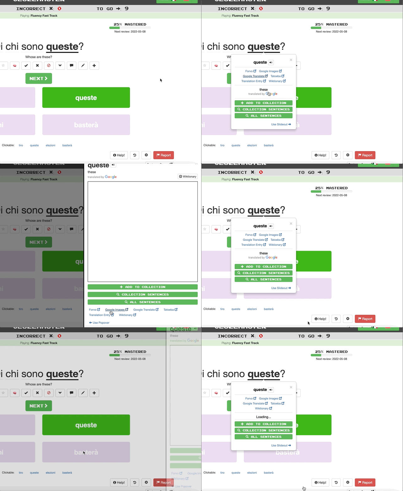
![]() Temporary solution until we come up with something better. Please let us know if you notice any issues.
Temporary solution until we come up with something better. Please let us know if you notice any issues.
@LuciusVorenusX could you please let us know if you’re still seeing the Firefox bug?
@mike I am still getting the Firefox bug (Firefox recently upgraded itself to version 100.0), BUT on both Firefox and Chrome I’m not seeing the temporary solution; I’m still seeing the full length panel on the right from the moment that I click on it. (That’s as at 20:40 Australian Eastern Standard, 10:40 UTC, 7 May in case the update has yet to flow through.)
I get the full length panel, but it now has an option on the bottom for “Use Popover”, as shown in the video from @mike
Clicking that option then takes me to the popover … and then I have the option to “Use Slideout”
That is valid as at 19:00 Australian Western Standard Time, 11:00 UTC, 7 May (in case the update has only just appeared after you sent your message).
@LuciusVorenusX 0/2 I suppose. Thanks for letting me know. To be sure, could you please confirm you’re not seeing that “Use Popover” link at the bottom like @zzcguns posted (thanks for that!)?
@Mike: I wasn’t last night; I am as of this morning; that’s all working fine and dandy. I probably should have restarted the browser completely before checking. Selection of the cloze word in Firefox is still a one shot deal, though.
I’ll mention this in passing too, though I don’t know whether anything needs to be done about it since hopefully it won’t affect many people. On my home computer Firefox works as normal (with the proviso about the one shot selection of the cloze word). That is now running Firefox version 100.
My work organisation has locked down upgrades on Firefox, however, so it’s still running 99.0.1 (64-bit).
As of this morning, on that version when I go to review a custom collection I am not given the option of what type of review to do. I’m used to Speaking not being there - I have to go to Chrome for that - but the choice between Vocabulary and Listening isn’t there either:
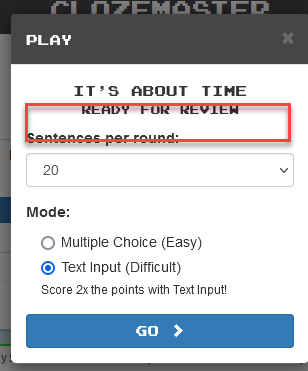
Also the audio doesn’t play when I hit Ctrl+Spacebar. For a STANDARD collection, the usual choices are available and the audio works normally.
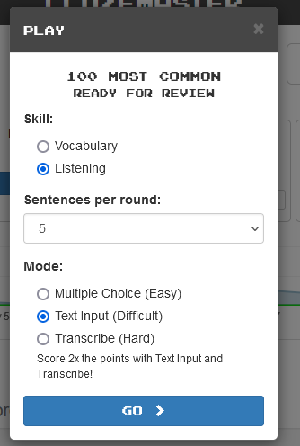
I’ve never seen this before so it is possible (but not certain) that it’s related to the popup changes.
As I said, I don’t think this is one to lose too much sleep over because I would say that the majority of people are able to have Firefox update automatically, and I’m not seeing the issue in Version 100 on my main computer. When I have some time I’ll manually update it on my work computer.
It’s more of an “FYI” in case this kind of issue comes up again.
Great!
And thanks everyone @here in this thread for all the feedback. It’s very much appreciated. I’m personally very excited about having Wiktionary autoload in the slideout, I’ve found it to be super helpful so far for quickly confirming lemmas, checking conjugation tables, etc. You all raised good points/issues, however, so hopefully being able to choose popover or slideout will continue to work well for now while we try to come up with a better one-size-fits-all solution (if one exists ![]() ).
).
@LuciusVorenusX I don’t think that has to do with the changes here - the TTS for custom collections still depend on the browser. It sounds like the work version of Firefox might simply not have the voices available. How often do you play on that browser? Might there have been any browser/OS updates on that machine?
