About the (newish) Clozemaster app for smartphones

Perhaps I missed it, but re the Clozemaster app available in the Apple Store for iphones… has it been officially launched or is it some sort of a test?

I’ve always figured that Clozemaster is one thing that works better on laptops, for to do text entry in a hurry, there’s nothing like a full keyboard.

I use the smartphone app when I’m on the road and don’t have the laptop with me… and it seems to work best for those language pairings I don’t know well, and for which I use multiple choice.

But for my main pairings, I’ll be staying with the laptop version.

Any comments?

4 Likes

I’m living in Chile (I’ve been told that learning Spanish here is like learning English in the Hebrides), I just started using Clozemaster and I’m working on listening. How do I get more voices “on my device” (like I seem to have on my laptop), and can I randomize them in the iPhone app?

And now there’s a radical redesign of the user interface for the Clozemaster app for smartphones… no change to the way the program works… but it’s interesting that the overall leaderboard is either hard or impossible to find. Part of the overall program to ‘discourage’ (rather than prevent) people from just loading up on points, to the detriment of learning languages?

I can’t speak for what’s happening in Apple-land, but my Android app looks pretty much the same as it has for… I don’t know how long, now.

To the best of my knowledge the overall leader board (as opposed to the one for your language) has never been part of the Android app.

I think you may be overthinking that. As a rule of thumb it takes more time and coding to do something (and test it on various phones) in an app than it does to just generate the HTML for a web page on your web server and hook it into a back end. Also you have to be conscious of the way an “over-featured” app can suck the memory, performance and battery life of a mobile device, which may not endear you to customers. This is a powerful incentive to only put in the features that are somewhere between important and essential to the end users. The leaderboard for your language? Sure, I can see people wanting to check that to measure their performance. The OVERALL leaderboard? I’m not so sure that it would be looked at regularly by most people. It’s a curiosity, but it’s really not that important because it’s comparing a mixture of progresses. Much like the overall “level” number (as opposed to the level in an individual language), it doesn’t tell you much.

I think its absence in the app is more a question of efficient resource deployment rather than an exercise in social engineering.

3 Likes

Obligatory @mike .

OK, I take this back. Normally my phone advises me if apps need updating, but it didn’t for CM. However when I looked in the PlayStore I saw that there was indeed an update available so I hit the download, and … Eeeyow, my first reaction was something like this.

But then I looked more closely at it and saw that all that had really happened was to shift the stats off to another page, and I thought… eeeeh, that’s not so bad. Alllthouuugh… for me, it brings a few usability issues front and centre, both in app and web.

App-specific first.

On the Stats page:

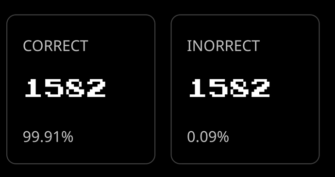
Leaving aside the spelling of “inorrect” (sic)… yeeeeaaah, I’m pretty sure those numbers aren’t right, and that 1,582 cannot be both 99.91% and 0.09% simultaneously.

The “Incorrect” number was dumped from the Web version quite a while back, which I think was a positive move. Not because I think the number can cause hurty-feewings, but because it’s pointless, since there’s nothing I can ever do to “fix” past errors. Also there is no qualitative value to the number. Some will be genuine errors, some will be fat-finger tyops, some will be where there are multiple possible answers and I just punched in the wrong one… so the correct / incorrect ratio has no value, in my humble.

Now, as to the home page… the collection order niggles me a little. The collections by default appear in the order that you last played them, with the most recent at the top. I get why this is, the assumption is that you will want to continue playing the last collection when you start a new session.

BUT…

If you have in fact played all of those questions such that you are in review mode for that collection, and you hit “Play” on the collection, you will of course go straight to the “Round Completed” screen since there are no more questions to play. At least this isn’t as bad as on Web where instead it will bring up the Skipachu gif, who is about as welcome as an explosive case of diarrhoea (and for me, often induces one), but it does mean that having a fully completed collection at the top of the list is an exercise in pointlessness.

You have to scroll down to the first collection where you DO have “unmastered” questions. Frankly I’d rather have a [Play] button if there are new questions, a [Review] button if reviews are available, or both if both are true, with mastered collections with no reviews available dropping to the bottom of the list. Which leads me to this…

The “Review” grouping is sliiiightly better in that at least you can sort… but only by count, or alphabetically. But it doesn’t offer the most useful sort order, which is sort by date last played, both ascending and descending so that you can EITHER bring up the most recently played collection to continue where you left off, OR bring up the oldest collections to the top so that you can give attention to sentences that you haven’t looked at for a while. (None too subtle aside, “and boy couldn’t Web do with that option as well, it could, it really, really could.”)

However, I have saved the best for last, which is this… Speaking on Android seems to have been fixed to match what web does. In Web, it waits for you to complete speaking before it does the playback of the sentence. In the android app, it would start speaking as soon as you said the cloze word so it would be talking over the top of you if the cloze was early in the sentence, so you’d never get to say the full sentence. Thank you, thank you, THANK YOU for fixing that! I had largely stopped using the app for speaking because of that.
There’s a lot to unpack here - thanks for the all the feedback! And apologies for missing the initial post @Romanophile. I’ll respond with more later today.

1 Like

It’s for real! :tada:

@LuciusVorenusX response is pretty accurate.

Great, though we’re aiming for higher than “that’s not so bad”. Thanks for all the feedback, super helpful. We’ll get the incorrect stat and typo fixed. Agreed incorrect probably isn’t super useful. Some of these stats we added, and try to get feedback, but it’s difficult to gauge who finds what useful or not.

Thanks for the input here as well. Most of that should be doable, will see what we can get queued up.

:raised_hands:

Any other feedback please let us know of course. I’ll likely aim to keep the conversation related to version 2.9.4 of the mobile app in Don’t fix what isn’t broken.

2 Likes

G’Day.
How do I speed up the audio sentences in the app (Android)? The 1x Bar doesn’t work.

G’Day! What version of the app are you using? A fix should be in place for version 2.9.4. To be sure, you mean the speed slider in the game settings when you tap the gear icon top right while playing right?

Hello, Mr. @mike!
Yeah, I mean that slide bar. I don’t know how I could post a picture or else I’d do it. His upper title is Default Speed.
It’s like: 1.5x
--------o------------------

1 Like