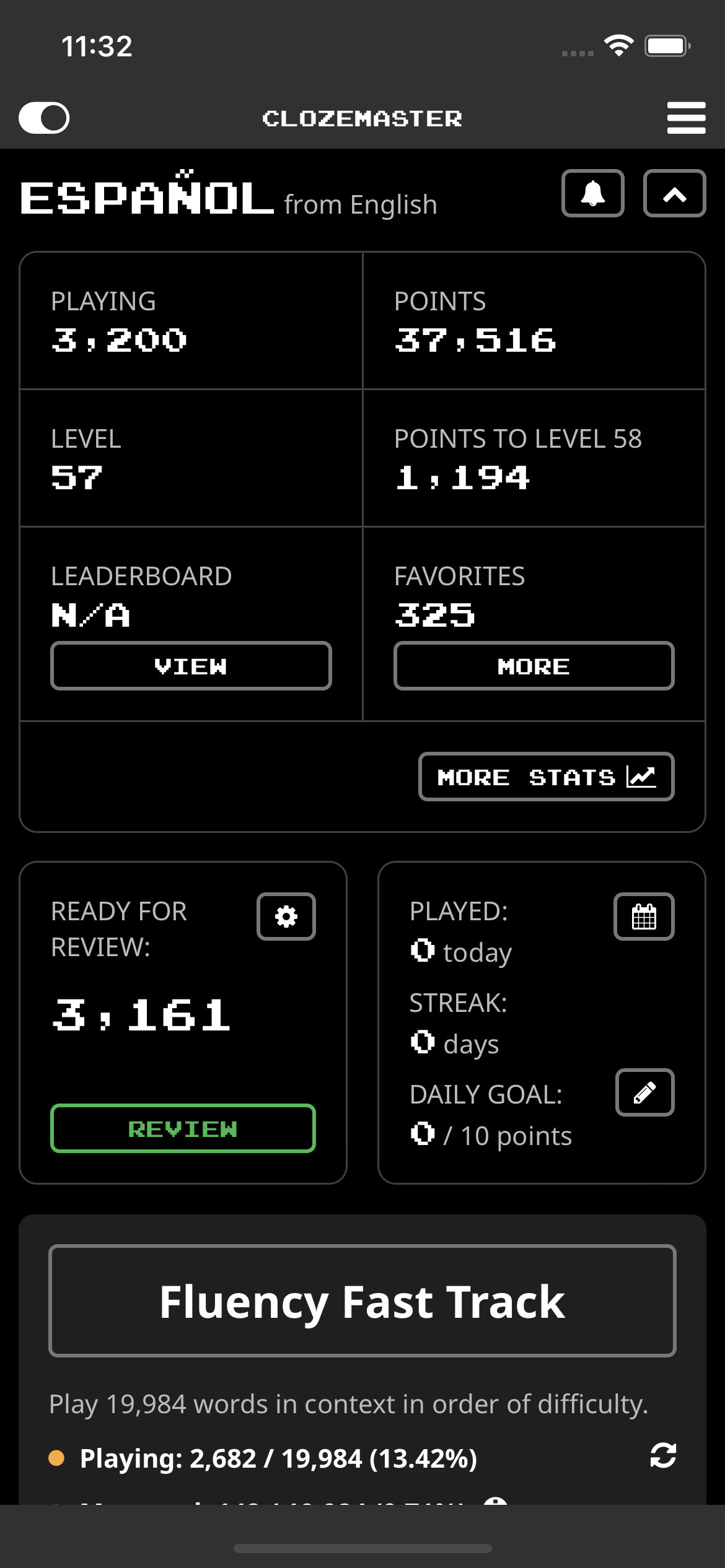
I must confess that I didn’t like the app update at all. The old interface was tidy and enjoyable, with easy access to the stats at the top, but now they’re messed up, and the app doesn’t look nice.
I’m going back to the previous version and hope it continues to work in the future.
I have to agree. Wish I could roll back on the iPhone. It’s hard when you have a system and muscle memory that have to be retrained. Hopefully it won’t morph again by the time I adapt.
Before I checked the forum, I literally thought, “If it ain’t broke, don’t fix it.” When my brain and fingers know to scroll here, tap there to get what I’m looking for, I don’t have to think about it. Now I do. For example, having to go to a second page and scroll-scroll down to see the leaderboard is annoying. I have to retrain myself to find things I’ve been using over two years. I’m a bit older, so learning new tricks that don’t represent actual improvement is frustrating. Clozemaster remains very useful to me so I’ll adapt.
What I meant was that the new interface doesn’t take into account that some stats are more important than others and should be easier to access and visualize.
The level, the points to the next level, the position on the leaderboard, the number of active sentences - all of them important - are now hidden alongside very specific stats, such as the number of sentences marked as known, which is quite annoying and counterproductive.
These changes obviously won’t make me quit CM, but I hope this feedback is useful, though.
I wonder if we could perhaps bring back the functionality where tapping the stats button (that now brings you to a new screen) toggles a series of stats on the dashboard (like it did before), and perhaps taking a step further, also shows a “more stats” button that brings you to the new stats screen (similar to how it worked before). On that screen you could toggle which stats you want to appear on the dashboard (and perhaps in what order in the future). Trying to show all those stats on the dashboard seems like too much / overwhelming in most cases (which was the rationale for the change, though I could be off here too, as it sounds like we may have been in moving most of the stats to a separate screen).
Any and all additional feedback is very much appreciated - thanks again!
@mike Mike this isn’t really applicable to the update, but is there any way to make it so that after I submit a word in text input and press enter, that the keyboard doesn’t go away, and I can hit enter again with my thumb instead of moving my thumb all the way to the top to hit the next button. It really slows me down and having to reposition my hand on the phone is really aggravating. Maybe it is just me, but 100% why when I use Clozemaster on my iphone I use the mobile site and not the app. When I do CM on Safari or on a web browser on my laptop i can just press enter twice.
I was going to suggest this. Customization seems like the way to go, since we all care about different stats.
The huge ready for review count is not helpful to me, since I ignore the reviews in many collections. But I miss the separate counts of new and review sentences done today. Others might prefer the opposite, so let us customize the dashboard.
Additional dashboard stats are back and toggleable in 2.9.5. Still not yet sure whether to make the recent history graph toggleable. @jamesp999 text input now has the “Next” button at the bottom of the screen - a compromise on double tapping enter.
More feedback is always welcome, thanks again for the input above!