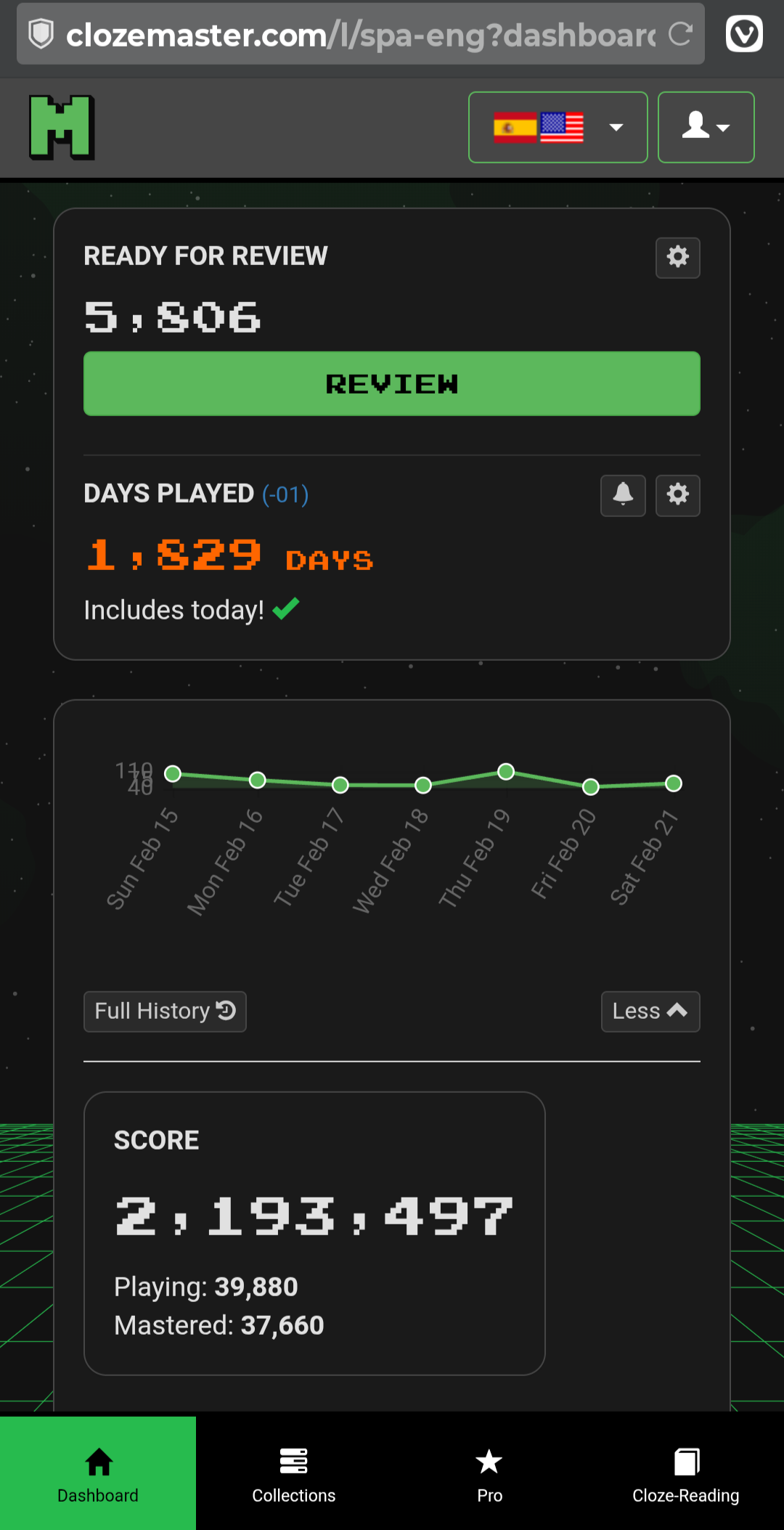
Another thing about the new design: it’s a lot less space efficient on a phone, as can be seen in in the two screenshots below.
And, more importantly, where did the global search go? Even though it’s broken (it doesn’t encompass any of the new collections not sourced from Tatoeba), that’s not a reason to remove it.
Also missing in the new design are the icons to see the review forecast (now available as “More stats”) and to add a new cloze.
Oh yes, that’s certainly does appear to be a big step backwards compare to the current design.
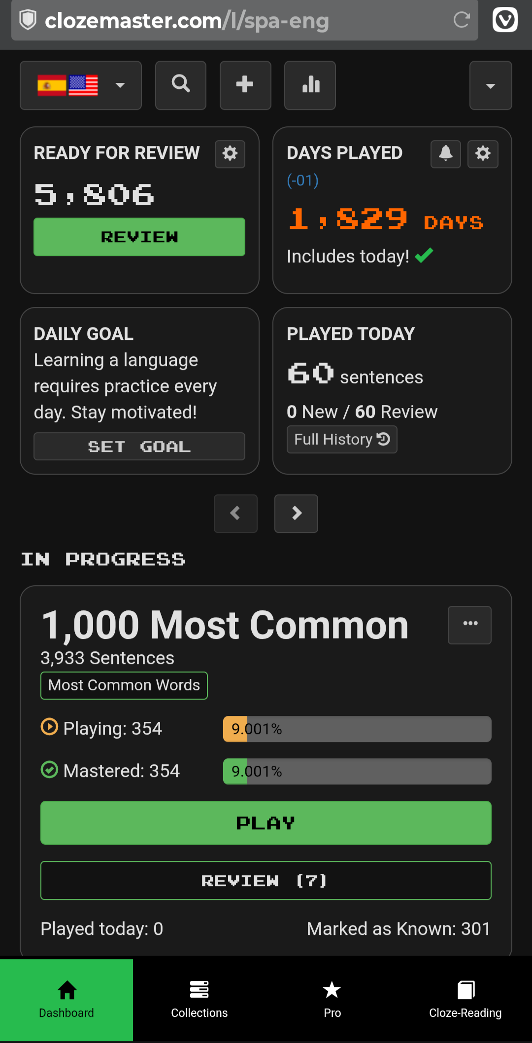
I mean, it appears to be extremely inefficient for those rare individuals who might want to play sentences from their collections .
I see that you have pressed the “More” button next to the graph in this example, which does make it appear worse than if that hadn’t been pressed. Having said that, some people might want those game statistics permanently available, in which case this does look to be extremely inefficient.
From your example, it appears that the graph provides no useful information whatsoever as most of the space is taken up displaying the dates.
Even if you don’t press the “More” button, is the next thing on the page the frame telling you to set a daily goal?
Do you know whether the sentence search (magnifying glass) and add sentence to collection (plus sign) are completely removed, or if they are hidden under the account menu or similar?
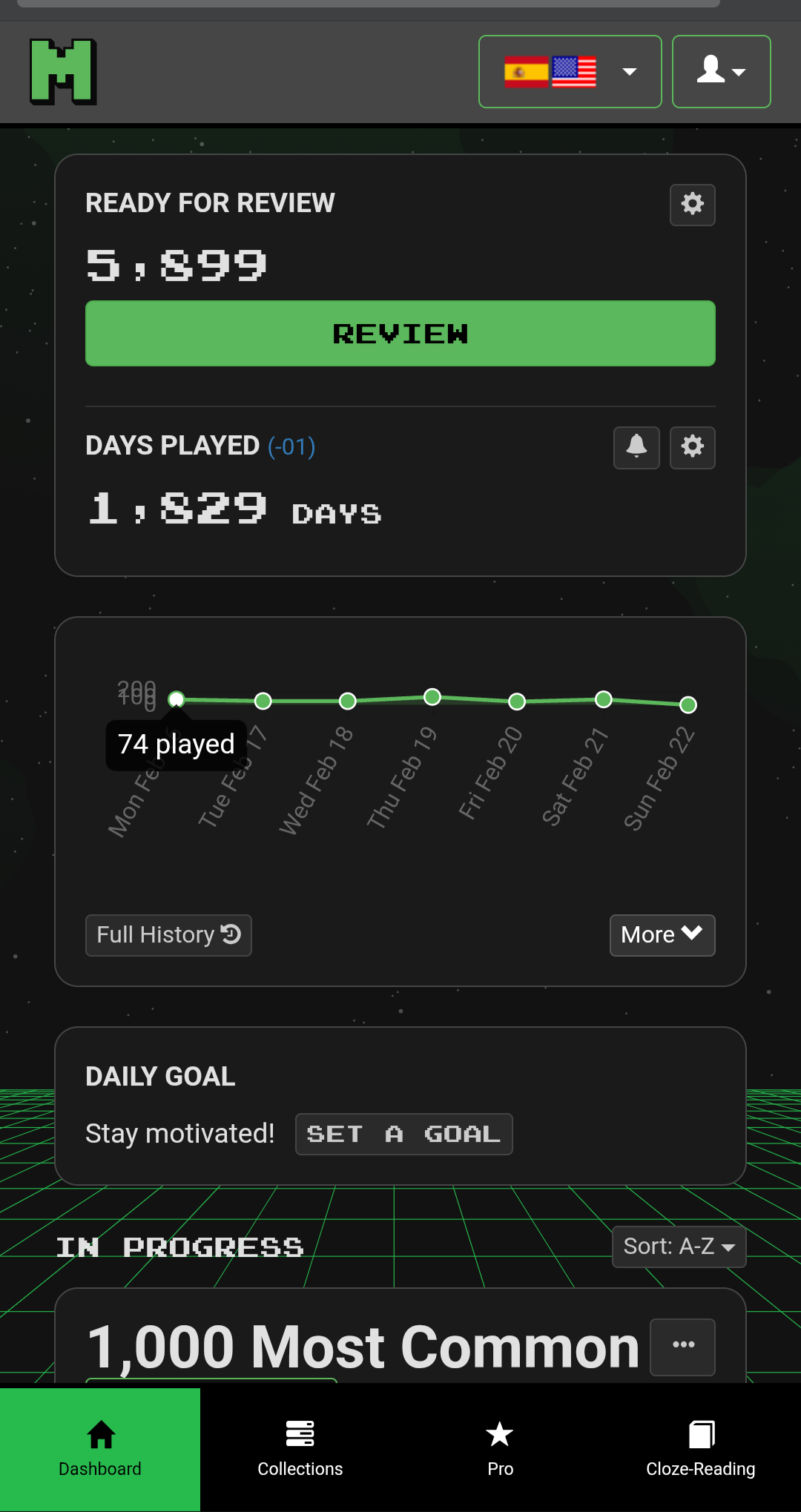
Below is what it looks like after pressing “Less”. Re the missing search and add-sentence icons, I can’t find anything replacing them on the Dashboard.
Hi @morbrorper Can you help this IT illiterate how to get back to the previous interface?! I’m trying hard to like this new one but … grazie in anticipo!
Thank you so much. May persevere for another week while keeping this valuable info close to hand; -) Grazie mille!
Later: Ah, just found another page of useful info tucked under the tiny green circle (daily goal) next to *days played in menu above the graph. I have to admit that it pays to “read the instructions” as it were, and if I had read zzcgun’s comments first I would probably have been slightly less uppity.
My question is: Is there a Time Played for today’s session? I know in the stats it shows total time played, but having a ‘time played’ for the current day would be nice to see.
I have so many uses for the global search; off the top of my head, these come to mind:
When somebody posts a doubt about a sentence, it’s useful to be able to go to the source collection. If the sentence is from any of the new collections, there’s no way I’m going to go through each and every one of them.
When I come across an interesting word or structure, I might want to add a matching sentence from the corpus to my reviews.
When I have doubts about a word or structure in a cloze, I might want to look up other usages in the corpus, to see if it’s an isolated occurrence.
For all these uses, it’s very frustrating to know that a large part of the corpus is unavailable for search.
(I remember having answered a similar question before, but I cannot find the post.)
It would be so great if you would add word count somewhere as well. Or list of words and percentage of mastery for each word. It would help so much to have something like this when start working with a new tutor, so they would be a bit more familiar with your vocabulary level. It is quite important for self-measuring your progress as well.
Today I wanted to investigate a potential problem with a sentence, reported in these forums, so I opened the Dashboard for the affected language mapping, only to find that there is no longer a way to search all collections from the Dashboard.
This is a sad example of essential functionality removed in the reworked user interface. As I’ve pointed out many times, the search facility is rudimentary and doesn’t cover the newer collections, but its disappearance is nevertheless unacceptable.
Sooo… it seems that the text in the “Are you sure you want to leave?” box has been changed to–
“Exit round?”
That’s not an improvement.
Do you know how sure I am that I want to exit? So sure, that I already know exactly which page I want to navigate to, and I want to click on that page and go there immediately.
But wait - I can’t do that anymore. I have to futz around making two extra clicks for no reason.
I’m not a computer person. I need you to explain it to me. I’ve gone overnight from being a keen user of Clozemaster to feeling quite dispirited.
There’s a button at the top with a magnifying glass icon on desktop viewport and button at the button of the dashboard on mobile viewport. Please let me know if it’s not there.
Sounds like you’re pretty sure. The confirmation has been removed.
Please enable these buttons on the mobile viewport as well, as they were before. The buttons at the bottom of the Dashboard (above the huge page footer) require a lot of scrolling to reach.
Mesh-wise, absolutely love it and have even settled with the new version (though I keep zzcgun’s advice close to hand, just in case. (I noticed the mesh “off button”, very thoughtful, Mike). A few niggles here and there but nothing too serious.