Dear Mike,
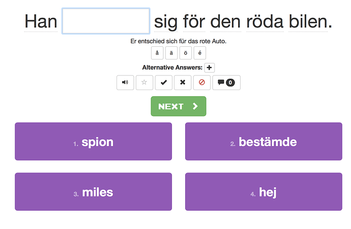
the size of the input box in text mode is so precisely the length of the word, that it tells you too much about which words fit and which ones don’t. This is especially so, since the font is not monospaced.
I think the boxes should have a minimum size and then get larger in multiples of this minimum.
Is the size of the boxes a bug or a feature in your mind?
I.e. here after viewing the hint I immediately see that only one word fits and I can not avoid to notice this…
This screenshot was taken in Safari for Mac.
Best,
Zacharias
Hi Zacharias,
Thanks for your message! Making the blank a constant size is a toggle-able setting. If you go to the game settings bottom right while playing, you should see a ‘Text Box Size’ option. Please let me know of course you don’t see it or have any trouble.
If you have any further feedback or there’s anything else we can do to improve Clozemaster, please don’t hesitate to let me know.
Thank you again for your feedback and happy playing!
Georgiana
@Clozemaster
3 Likes
