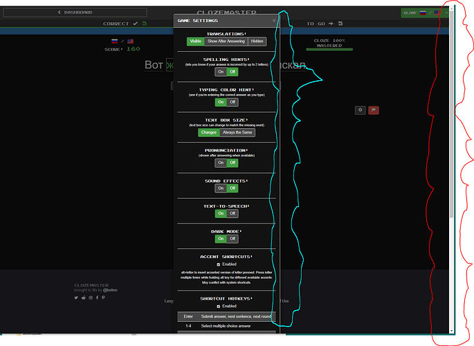
When you scroll through the “Game Settings” dialog (which you must, since it’s long), the scrollbar is not where you think it should be, namely on the dialog (light blue line). Instead, it’s all the way on the right (red line). Not only is this unexpected, but it forces you to keep moving your eyes from right to left and vice versa.
I’m bumping this because (1) it still bothers me, a year later, and (2) I wanted to mention a related issue, namely that the grabbable part of the right scrollbar (at the top in the screenshot) looks quite similar to the space where you need to move it to (at the bottom in the screenshot), so it’s hard to see. Issue (2) may not be specific to Clozemaster, but it exacerbates the problem of finding the right thing to drag. Furthermore, with the current placement of the scrollbar, if you click a few pixels to its left by mistake, the dialog goes away altogether, whereas if the scrollbar were on the right of the “Edit Sentence” dialog, clicking a little to the left would ideally do nothing (as long as you didn’t end up in an active field).
