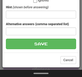
I find I’m often saving to the wrong collection, especially when using my phone’s browser where I don’t see the top of the page as I eagerly scroll down to save my new entry. Therefore I suggest that the name of the target collection be shown in the SAVE button.
BTW, writing this post on my phone was unnecessarily difficult because the input form is wider than my screen and does not adapt to my screen dimensions. 
