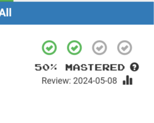
Here’s an idea for @mike: How about making the percentage icons in the top right corner clickable? Clicking any of these icons would directly set the percentage accordingly.

The idea is to make it easier for the user to change the degree of mastery, without having to enter the Edit dialog.
And while you’re at it, could we perhaps get rid of the question-mark button immediately below, or move it out of the way? It’s too close to the statistics button for my fat fingers. ![]()