I’m finding that when I use the new button to bring up multiple-choice options, the cursor then tends to position itself somewhere that makes the explanatory text on that or another nearby button remain visible when I progress to the next sentence. To avoid this I often have to manually move the cursor.
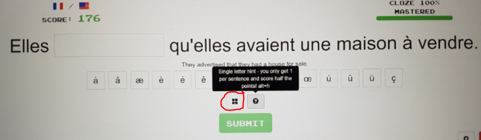
I found the previous location of the multiple-choice option button, at the end of the sentence, much easier to use. It seems to have become smaller as well as move to a place where you have to touch it / position the cursor more accurately for it to work.
Similarly, when I use one of the accent buttons, the explanatory text on it also stays visible for the next sentences unless I move the cursor.