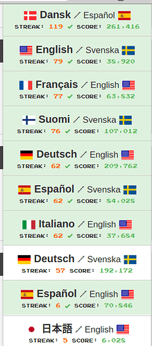
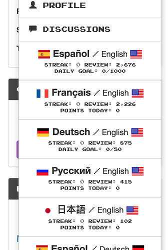
I find that the overview of my status per language is a lot better in the Android app than in the browser. The most notable difference is that the app allows me to easily see the number of Ready for Review, which to me is the most important metric of all.
Thanks for the feedback! Curious to hear more of what you have in mind. The number of Ready for Review is front and center on your dashboard on the web.
Sorry if I was unclear, I was thinking of the dropdown menu on the right, where I currently only can see my streak and my score for each language. That means I have to go to the dashboard of each language to see the review status.
Personally, I would very much prefer to see the review status than my score. On the other hand, maybe I just shouldn’t be doing so many languages 
I’m wondering if any improvement is forthcoming.
To be specific, the top-right dropdown menu and the Profile page should display the number of items ready for review, for each language pair, just like “My Languages” does in the App. In the menu, I don’t see any reason for displaying the score at all, as it’s just a rather meaningless number.
Thanks @mike, much appreciated!
Now if only the number of review items were a bit easier to read; the green color and the minuscule font are quite challenging for the eye.


