I'm not sure I love the new colours for the buttons in Web

So I noticed this morning that a number of the buttons in the Web interface - your name tag at the top right, the [Play] buttons next to collections, the [Submit] and [Next] buttons as you’re playing - have changed from white text on a green background to black text on a green background.

It’s not a disaster, because the text CAN be read, and if you’ve been playing ClozeMaster for any length of time you probably play without ever even looking at the button text. But I’m not wild about it.

Legibility is usually a question of contrast, and to me the contrast between white and green is WAY more legible than the contrast between black and green, especially for those whose close range eyesight may not be what it once was. (And I WISH I wasn’t speaking from experience there, but unfortunately I am.)

I’m not making a call to “Bring! Back! White!” but when changing a colour scheme (which this may or may not be the first step of), then to me, the first loyalty needs to be toward legibility. Just my humble opinion…

7 Likes

I don’t have a firm opinion about the new look, but I appreciate your post as it confirms that it’s just not my imagination that something has changed in the visual department. :slight_smile:

6 Likes

Although it’s probably just a matter of time (and getting used to the black on green color), and I probably wouldn’t mind the black color anymore after some time passed, my immediate thoughts are:

There are now quite a number of font colors:

  • some text is white
  • some text is gray
  • some text is blue
  • some text is orange
  • some text is green
  • and now some text is black

That’s quite a lot of colors. Simply for simplicity, I would probably prefer going back to white, since it would reduce the number of colors from 6 to 5. I think less is more in this regard.

2 Likes

There’s also a lack of consistency between the “Hard”, “Normal”, and “Easy” buttons. They all used to have white text, but now the “Easy” button has black text.

2 Likes

Strangely I hadn’t really noticed a colour change, just that something seemed different and perhaps brighter.

2 Likes

Yes, that is odd, although I SUSPECT (but cannot prove because I’m too lazy to take the HTML apart and analyse it) that the various buttons use different CSS (Cascading Style Sheet) elements, and it was only the one(s) with a green background that was/were changed.

Contrast wise black would probably work better against the orange, though the existing white works well enough. (Black even works well enough with that green; it’s the dark green background that it becomes hard to see on.) As for the red… that’s a pretty desaturated red so either black or white would probably work well enough on that.

(Digression: As opposed to, say, what Microsoft decided to do with PowerShell where it put error messages in dark red to! make! them! stand! out! The problem is that the classic PowerShell console background is dark blue, and saturated red on a dark blue background equates to “there was some sort of error, can someone please call Superman to read what it is?” Yes, you can change the background colour… at the risk of screwing up the visibility of other inputs and outputs. I don’t know what they were drinking at Redmond when they came up with that, but it should be outlawed as “brain rotting”.)

1 Like

I also find the recent change in the coloring in the Web interface “worse”. The change doesn’t take into account people with color vision deficiency (color blindness).
The World Wide Web Consortium (W3C) gives comprehensive standards and guidelines for accesibility. It clearly recommends that

Web text has a contrast ratio of at least 4.5:1. (see Article 1.4.3 Contrast (Minimum), WCAG 2.0)

A color contrast ratio can be calculated on this online tool by Deque University. I hope the Clozemaster team be more familiar with these industry standards.

3 Likes

Thanks for all the feedback here! You guys are the best.

We made the change for accessibility reasons - like @MsFixer mentioned there are standards and guidelines for accessibility around color contrast ratios. The white on green fails accessibility contrast checks whereas black on green passes.

@MsFixer I appreciate the links, but I’m not sure what you’re talking about. Did you actually check the colors in the online tool you linked?


We’re aiming to make more design and accessibility improvements as soon as possible, but this change seemed like quick low hanging fruit that would hopefully be an immediate improvement.

Speaking to legibility @LuciusVorenusX, thanks for the input. We’re aiming to do better adhering to accessibility standards like I mentioned, but perhaps there’s a better color combo we can consider.

@davidculley agreed there are too many colors. We’re aiming to get to a number of design improvements this year as there are many more improvements to be made beyond colors.

@alanf_us good point about the Easy, Normal, Hard buttons - thanks!

Anything else please let us know. Thanks again!

3 Likes

I’m happy as long as there’s no Duo-type kiddie animation, please no!

1 Like

@mike
You ignore white background of the whole page (i.e. a big canvas) and just focus on the small buttons and texts.

You’d better benchmark X (former Twitter). When in a normal mode, the “new posts” button has light blue background with white text. When the color contrast is amplified, the button turns into darker blue with the same white text in order to increase the two-tone color contrast.

Normal mode:

Change setting:

Better contrast:

What you did is actually an opposite approach. You changed the color of text from white to black. That makes a more vague gradation of three-tone coloring from white background of the whole page —> mild green background of the button —> black text. That’s why some Clozemaster users including me feel harder to read in the new color combination.

Don’t change the color of text. Make the background color of buttons darker instead.

3 Likes

So I’d like to start by saying that I appreciate your efforts @mike in trying to continually improve Clozemaster, and your engagement with the user community on this forum.

In trying to improve accessibility for people who have colour vision deficiency, I would also assume that there’s no better starting point than to go to the standards bodies, and take on board their recommendations.

I don’t have any colour vision deficiency that I am aware of, and so these changes shouldn’t really affect me for better or worse.

However, like several other people in this thread, I do find the words displayed using the new colours slightly more challenging to read. Let me be clear though that this isn’t an important issue for me at all, the boxes are still legible, they use large enough font sizes etc., it’s just that it looks a little less clear to me with the black on green.

Now in my case I use dark mode when playing, and I think that this is part of why I find these symbols a little less clear. @MsFixer mentioned three-tone colouring, but in my case I think that the fact that there are only two tones going from dark-mode black background, to green for the button background, then back to black for the writing, is why I find them less clear. With dark-mode on, the black writing looks more like a hole in the green button than actual writing.

Here’s a screenshot of me playing sentences, with white on green, and black on green, with neither of these (in my opinion) offering a good contrast:
CM_colours_greens_white_black
It seems that the white writing is on the brighter shade of green, and the black writing is on the darker shade of green.

Note the difference when “Submit” changes to “Next”, and the shade of green appears to change (leading to a better contrast):
CM_colours_greens_white_black_next_button

In this case there’s also a change from a plain button to one with a “shadow”.

Then there’s the fact mentioned by @LuciusVorenusX that there are multiple shades of green. How many different greens are there in this screenshot ?

I don’t know how many greens there are here (3?, 4?, 5+?) to be honest. Also, although I appreciate that there’s a different in font sizes, the “Round Complete!” message and the “Continue >” writing on this page, is one of the few cases where you can still compare white-on-green versus white-on black. In my case, the “Continue >” writing is the weaker of the two as it doesn’t stand out given that the global background is black in dark mode.

As I mentioned earlier, I don’t have any real difficulties with any of this as I don’t have colour vision deficiency.

Also, I like having lots of colours. Life’s more fun with lots of colours. But, … maybe for each colour (green in this case), just one particular shade would be enough :grin:

7 Likes

OK @mike, if you want to improve accessibility and ease of reading in the Clozemaster user interface, then I have a suggestion, but you’re not going to like it. Really, I’m pretty sure you won’t like it.

Here goes …

Get rid of the 1980s arcade style 8-bit joystix font.

:scream:

There, I’ve said it out loud.

Yes, I agree, that does indeed make me some sort of unspeakably evil monster.

Oh @mike, please stop crying. No, no, honestly, it’s not that bad really, is it now. Come on now, pull yourself together. Come on, be brave!!!

Seriously though, it’s the joystix font that I find the most difficult thing to read on Clozemaster. I appreciate that in almost every place where legibility is important joystix has been replaced by a different font. I also appreciate that it’s the signature style of Clozemaster, and plays in with the gamification aspect, and particularly the 1980s arcade game style.

However, I no longer think that I’m back in the 1980s and that I’m John Connor playing Clozemaster in an arcade, looking around to see if Arnold Schwarzenegger’s Terminator is coming to get me. Errm, not that I ever really imagined that of course. No, that must have been somebody else who thought “just finish 100 more Clozes and you get to prevent Judgement Day”.

Oh yes, errm, back to reality.

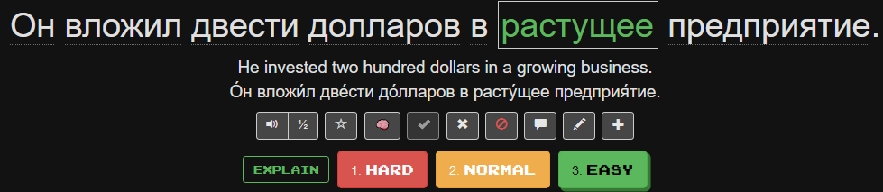
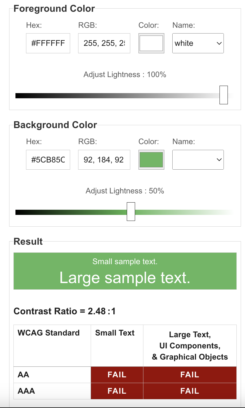
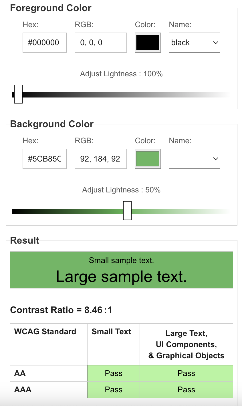
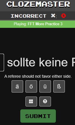
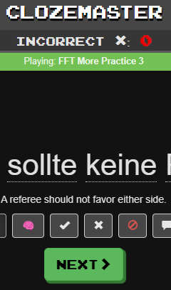
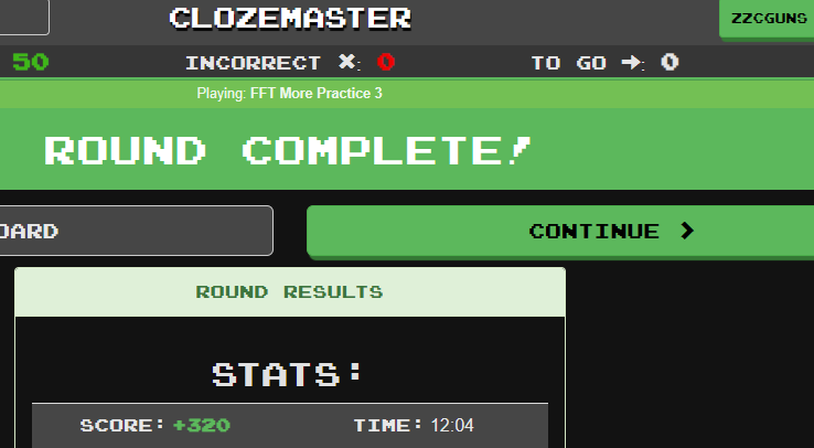
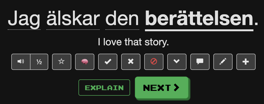
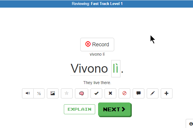
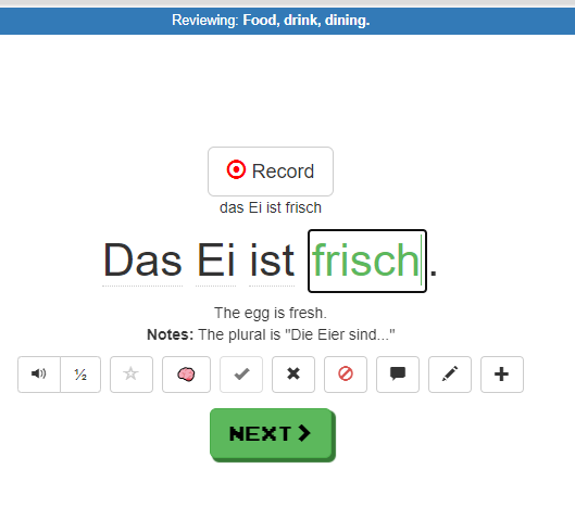
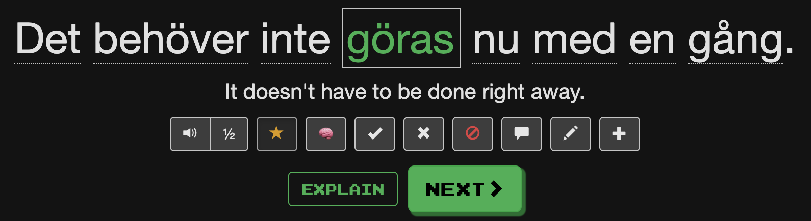
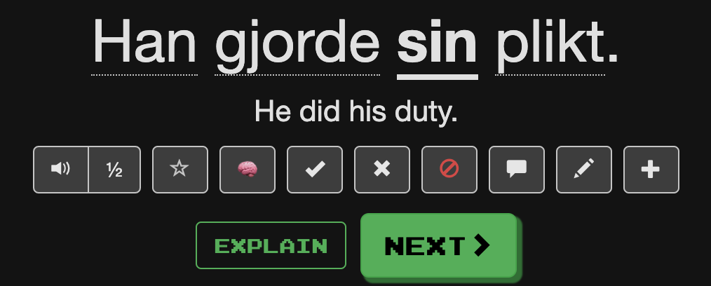
I’ve been playing Clozemaster for a few years, and I’ve turned off pretty much all of the gaming-style features, except for the one that I can’t change, namely the font. As I use Clozemaster as a serious language-learning tool, I have no need for the gaming-style font, but I do have it around still because that’s the way that the interface is designed, and importantly I find it difficult to read, particularly on these coloured buttons (e.g. black joystix font writing on a green background).

I mean, the font served a useful purpose back in 1981 when I used to play on my Commodore Vic 20. Back in those days though, I only had 22 characters to a line on my screen, and so each letter was enormous. Here’s a link to the splash screen gif on Wikipedia.

There are now lots of monospace fonts that could fill any niche where the Clozemaster interface needs or benefits from a monospace font. That is to say, there are a lot of monospace fonts that are much more legible that joystix.

So, if readability and accessibility are important, then please, please I humbly ask you to consider replacing the joystix font with something that doesn’t hurt my eyes when trying to read it (or at least make it an option that I can switch on like dark/light mode).

:pray:

1 Like

Thank you both for the thorough replies! Super helpful. We’ll see what we can do moving forward.

It had to be said. I appreciate the honesty. :slightly_smiling_face:

4 Likes

I liked that the cloze word was green (or rather, a salient color different from the regular color; it doesn’t especially have to be green, I’m not attached to the color green).

Now the green color has sadly gone. I find it now much, much harder to clearly see at a glance which word was the important word of the sentence. The only difference now is that the cloze word is bold, which is hardly visible (at least to my eyes).

Given that all the other words are also underlined (albeit in a dotted way, not continuously), this makes it especially hard to see which word is the cloze word.

I think this is sadly a regression to how it was before.

1 Like

I have to admit that when I upvoted that comment I did so without actually checking (after all, there was a screenshot)… but I have to admit that when I did I’m not seeing this. (Of course, it could have been changed back.) I tried reviewing a built in collection (Italian Fast Track Level 1):
01_Review_FT1

Doing new questions in a built in collection (Italian Fast Track Level 2):

Reviewing a custom collection (Italian):
03_Review_Custom

And reviewing a custom German collection:
04_Review_Custom_German

In all cases the Cloze was still (or was again?) a delicious shade of green.

1 Like

Delizioso, esatto;-D

It seems to have already changed again. It now looks like this for me:

If I compare this with the screenshot from @alanf_us from just a few days ago, it seems that the translation and the original are now in the same color, instead of slightly different colors as before (if my eyes don’t betray me). As mike recently said, they want to reduce the number of different font colors. It seems there’s a lot of development currently going on behind the curtains.

However, the color of the cloze word is only back to green if you play the “text input” method. If you play the “multiple choice” method, it’s (still) the (in my opinion hard-to-parse) colorless variant.

1 Like

I’m also not digging the black text on buttons. On dark mode is not as bad (although I still much prefer the white text), but on regular/light mode, its definitely an eyesore.

I tried to wait a few days before commenting just to see if I would get used to it, but that wasn’t the case.

2 Likes