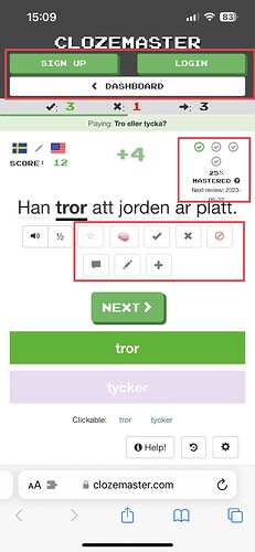
I’m thinking of starting to use Teaching Collections to quiz my students, but very few of them are users of Clozemaster. It’s good that they can use these quizzes without having to log in, but as non-users of Clozemaster, they find them very cluttered and a bit difficult to get into. Some think they have to log in to use it, and there are many questions about level of mastery and all the options shown.
My suggestion is to make the interface for Teaching Collections less cluttered by removing a lot of the unnecessary information and options for users who aren’t logged in. Here are a few of the areas that I think are unnecessary.
