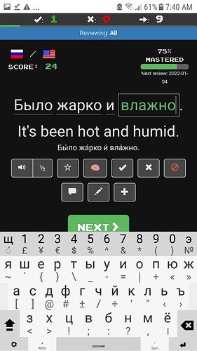
Fairly recently, a button with a “brain” icon was added. It can be clicked to indicate that a sentence is known and essentially never needs to be reviewed. The problem is that even when it’s not selected for a sentence, it’s so bright and colorful that it looks as though it is. By contrast, all of the other icons, with the exception of the “ignore” button, are white when not selected. I don’t mind so much that the “ignore” button always appears in color (though perhaps it should also be white when unselected), but I find the prominence of the “known” button quite distracting.
3 Likes
The favorite button is black-and-white when not selected, and yellow when selected; maybe the brain icon could analogously be black-and-white when not selected, and pink when selected.
 vs
vs 
4 Likes
