is quite alright but
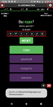
- please consider updating the size of the symbols (add to favourites, settings, close, etc…), its just really hard to hit something with your thumb that is this small, especially not on a 5 inch phone, as well as the general font size (not because of usability but because of readability)
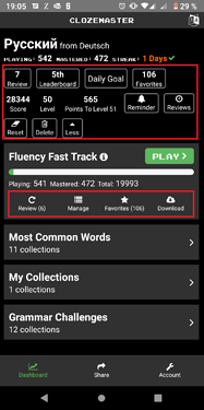
- please make points of interaction more visible. There is just no logic behind putting a square around ‘Leaderboard’, ‘Daily Goal’, etc. but not around the options ‘Review’, ‘Manage’ etc. right below the Fluency Fast Track
Other than that - thanks for the great work, I’m really satisfied with the new desktop experience 

