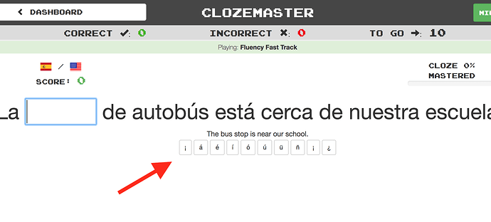
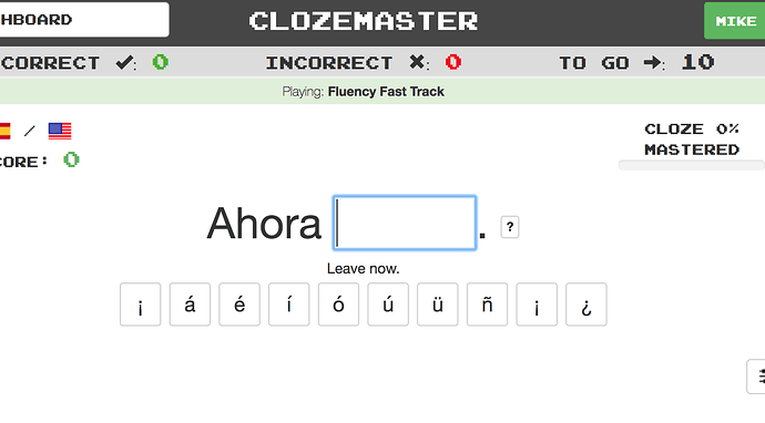
In September, I suggested a few UI improvements among which was the suggestion to increase the size of the additional letters when playing in type-mode.
Another issue is the size of the additional letters, in the case of my french game for example the ones with accents. While the legibility is okay on low-res monitors (if I remember correctly), on a high-resolution display like mine its pretty hard to differentiate for example an accent aigu (é) from an accent grave (è). Zooming in when being on the site is not really ergonomic…
Well, nothing happened so far which I found a bit surprising. Adjusting the size of a few elements shouldn’t really be that much of a challenge while being a massive ergonomic improvement, right? 


