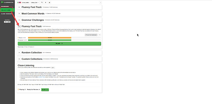
Yes, I really don’t like this at all.
“Cluttered” as such has never been a complaint I’ve had; my main issue with the interface has been that things have been tossed in over time and as a result it has become ridiculously hard to find some things. Example: The game settings being only accessible from when you’re playing a set, even though they are universal to an account. You get used to it, but it would be incredibly confusing for newbies.
“Hey, how do I stop these level up notifications?!”
“Well, first you need to start playing a set and THEN you can go into the cog, and THEN…”
Then there’s the review cycle setting which has the opposite problem, since it’s annoyingly universal when in reality it is NOT a one size fits all solution and would be better being able to be set by collection; a player WON’T typically want the same review cycle for “100 Most Common” if they’re down playing “10,000 Most Common” by that point. Which means remembering to manually flip the cycles before playing some collections. That USED to be on the main page but that seems to be gone.
After hunting around enough, I found it under the cog wheel icon of the Ready For Review block.
On the subject of discoverability, all the things that USED to be on the right side panel that appeared when you clicked the drop down next to your big, obvious name and language button in the top right are now under an obscure, small, unmarked drop down triangle. A visit to the forum is still a two click solution rather than a one click solution, though I’m wondering if there will be less traffic anyway since newbies may not even know that there IS a forum unless they’re the kind to wonder “Hey, what does this do”?
Where I, personally, have a problem with clutter is that in a lot of the collections, in 2 of the 3 languages I’m active in, I’ve played 100% of the clozes in the collections. That means that the overwhelming majority of the collections on the dashboard are, for me, clutter. Clicking on the (now huuuuuggggee, elongated) [Play] button will result in nothing more than the accursed sight of crying Pikachu, and thus the opportunity to practice swearing in my target language. The whole box has no value to anyone who has played 100% and is in review mode because (a) There is no review button in the box, you need to go through the Review button at the top, and (b) The play button is useless once you’ve played 100% of the questions (whether you’ve mastered them or not) unless you actually like rather than detest the crying Pikachu animation.
Agreed. Even leaving aside the aesthetics of it, at my normal browser window size I’ve got maybe a third of a screen of white space, and to me that’s just wasted space especially when things that I use regularly (like changing review cycles since I can’t set them by collection HINT HINT) and the Forum link are now buried away under obscure controls. To me, that’s a waste of screen space.
Edit: Also, to get to Activity Feed at all, you now have to go to the obscure drop down, and THEN go to Notifications, or Account, or some page that gives you the old control button in the top right, and then, only then, will you be able to find Activity Feed.
